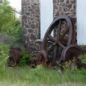
I like this, and i think the black and white really helps it. However there is something i'm uncomfortable with (but I don't know what!). I wonder if the rule of thirds might have helped here (i.e. bottom third plant, middle third field, top third sky) to accentuate the size of the field and distance contrast between plant and horizon. Just an idea.


![[No title]](/data/xfmg/thumbnail/37/37636-e02c7efccb426a8951ed97a37c0f9307.jpg?1619738157)