Please Critique

danny

TPF Noob!
Joined
May 18, 2005
Messages
82
Reaction score
1
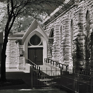
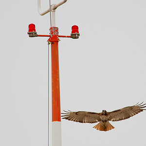
I got a bit of confusing feedback on this photo on another forum so I thought I'd post it here and see what you guys thought. Sorry about the high key areas but it was a bad day for lighting and no polarizer available. C & C welcome and appreciated, please be honest as I have a tough skin, and you may edit and repost if you please. 1/125, & f5.6 @ 80mm. 10D w/28-135 IS.
Thanks,
Danny

43857344.jpg
 
First I think that a smaller photo is in order. Even on my 17" monitor I have to scroll to see the entire image. As for photo critique, I might be inclined to crop the bottom at the body line on the door. I find the reflection distracting right away. Maybe even a little off the top at the top of the window opening to give it a 3rd's prespective. The lighting and exposure seem fine. I don't know if there would be much more I personally would do to this shot. I like it. When I'm his age I hope to also be driving a nice classic hotrod.
 
I must agree about the image size; it's harder to get perspective with having to scroll to view.

Well, given you didn't have a polarizer, I'd say this about as nice an exposure as could be had with these cirumstances. The high key areas you mention are only a slight distraction (worst being top left, which I'm sure you already know). But the flesh tones are lovely, in fact it's a glory to see someone who isn't pushing the saturation and letting soft colors BE soft colors. :thumbup: A small hot spot on the cheek is noticeable, but not overly distracting.

For a casual portrait, sitting behind the wheel like this, I think you've done very well. :)
 
Do I see a changed version of this photo now?
For the comments no longer seem to apply. It fits on my screen all right. And I don't see any reflection on the car body.

This is the kind of portraits that I personally prefer to any studio portraits. It seems nearer to the person who is being photographed. Like this one seems quite "at home" where he is. The light is natural and good to his skin.

The only thing that I don't understand is what kind of car he's driving? I miss a rear part to it... (I know little about cars, let alone American ones...)
 
I like this shot. It captures the driver very well. I know the color of the pick-up is probably important, but I would love to see this image in B&W. I think that B&W just captures the mood better. The blown out area in the top left corner is distracting, but I am nitpicking to give you some critique. And I wish there was some catch light in his eyes for more of that pop.
 
As a candid portrait it's fine. The problem with it is the car. There's not enough of it in shot for it to work as part of the picture - but there is too much of it in frame to ignore.
Try playing with the crop. Get rid of some of the distracting edge details like the door handle.
 
i actually don't mind the blown out areas for some reason... i know that it's a car door to a vehicle that's framing the subject (it's a pick up truck i think lafoto) and the soft yellow color is wonderful. the expression on his face is fantastic and i think your capture does him justice. There is a tiny hotspot on his cheek as somebody mentioned, but it's such a minor detail that i didn't notice it til reading the other critiques.

i also have no problem with the size of the photo, but i'm looking at a 19" monitor. i wonder how this will look in B&W also.
 
the blown area is distracting but more importantly, the mirror is not reflective of a 50's model pickup. :p

im not sure what you can do with frame but the mans exposure is spot on. i love his expression...looks like the kinda guy you'd like to sit and chat with.
 
I like the detail in the mans face but i'm with Hertz in that the frame if the car is quite distracting, for me mostly on the right hand side where you can see the body of the car end and the DOF effect on the background.. i'd suggest a tighter crop so as to remove that area.
 
Meh, I have a nice, huge resolution, so this fits on my screen just perfect. Yeah, that's a pretty nice picture if you ask me. I'd go with Scurra, and tighten up the crop lines just a smidge, though.
 
I want to sincerely thank everyone for the advice. This is exactly the kind of critique I needed. Sorry about the size, I use 1280 X 1024 and keep forgetting to resize for 800 X 600. Is there a recommended size for posting pictures? I'm new and still trying to learn. I'm posting a different crop of the photo so, if you have the time, let me know if this one is better. Also posting a photo of the whole truck for LaPhoto. It's a custom 1950 Dodge Pickup and the owner was a super nice person. Hope you enjoy it.
Thanks again,
Danny

44060299.jpg


43857342.jpg
 
danny said:
I use 1280 X 1024 and keep forgetting to resize for 800 X 600. Is there a recommended size for posting pictures?
Meh heh, I don't mind, I use that resolution, too. It's nice and big; good for people who have a camera with a high megapixel count. Still, though, I'd suggest resizing them for 1024 X 764, because that slowly becoming the most browser efficient resolution out there. Still, I would pity the poor, few 800 X 600 users...
 

Most reactions

Back
Top