Please sir, can I have some serious critique?

nukie

TPF Noob!
Joined
Jul 9, 2003
Messages
284
Reaction score
0
Location
Sydney, Australia
Website
iced.vanillashots.com
031109_drivein.jpg

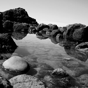
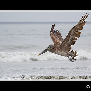
Sepia'ed in photoshop along with slight cropping and curves'ing.

031106_bird.jpg

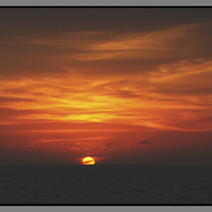
The noise is a result of the high iso and slight rain falling. Levels were adjusted lots to make the darks darker and lights lighter. Cropped to the max to compensate for a crappy zoom.

031106tt_waiting.jpg

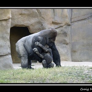
2 second exposure at F7.1. Slight burning on the far left and a little cropping.

031107_marble.jpg

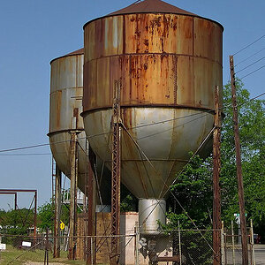
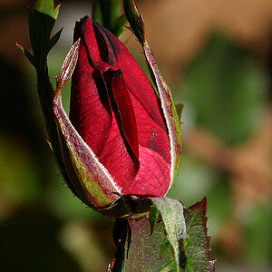
Standard G5 on macro mode, no cropping, slight levels (or curves, i canna remember).

So yeah, if possible, i'd like some thought out critique on them. Trying a few new methodologies when it comes to taking photos, and opinions on these would be very much appreciated.
 
I really like numbers 1 and 4, but 2 and 3 don't really do much for me.

Number 1: the clouds are what make the image and I think the sepia toning really added something to this photo. Something about the composition bothers me a little, but I'm not quite sure what it is. Maybe a little too much of the forground in front of the screen, but again, not quite really sure. Really like the shot though.

Number 4: Just a nice creative macro shot, incredible detail and the lighting (and color) really makes the shot interesting.

There are my thoughts...for what they're worth ;)
 
I like your clouds and toning in the first shot, but would agree with Chase that there is *something* lacking in the composition....would have been nice to see a couple different angles here, as long as you had that sky available. Love the empty screen against it.

I like the second one the best, very stark and dramatic silhouette in the rain. If possible, I'd crop out that top area of the sky; I don't see that it adds much to the image. Very nice, overall!
 
The first and fourth a very good, but the fourth is definitely the best.

In the second and third the photo doesn't appear to be about the subject. No story to be seen between the lines. Definitely too much surrounding space. The second could be much better with less sky, and the third if there was someone on the bench, especially a bum.

The first picture is off balance with the foreground and background. The sky is so dominating in the background that something needs to appear in the foreground to balance the picture. The idea of the speaker would be neat, but difficult to make "pop".

The fourth shot, macro of the ball is cratively very good. The light through the marble and textures really add to this one. Also the clear detail of the marble is wonderful. The darkening at the top really makes this one work.

Great job.
:)
 
These are all really neat. I think the first one would be nice if the foreground were cropped, to about the middle of the screen. It would leave a sense of mystery as to what it is, and the focus would be on the dramatic sky. The second one is a very nice combination of dynamic and still. I would crop the dark clouds at the top, but other than that, really nice. The third one doesn't do much for me. The fourth I like because it is a macro, but I find the subject a bit simple. The pic is technically perfect, but doesn't make me think, perhaps that is the point? :) Keep 'em coming!
-Alicia
 
The first one has some potential. Like others have mentioned, I feel like I'd be more interested in this scene from a different point of view. Maybe move the screen up a bit and work in some pattern or something with the speaker posts. Also, no matter what Adobe says, this looks more like a strong-mix selinium tone than sepia to me.

I really like #2. The noise makes it look somewhat like brush strokes. I think this one looks great as it is. The dark clouds on top, and the wires on the bottom do a good job of framing the image.

#3 and #4 don't do anything for me.
 
Thankyou to everyone that took the time to think about the photos and reply. Its very very much appreciated.

The main comment seems to be regarding the composition of the first photo. I agree with this wholeheartedly. But when you're shooting from a hole in the fence which isn't big enough to fit through, well, there isn't much you can do about it.

Mind you, I could always look for another/bigger hole in the fence.

Once again, thankyou to those that commented. I'll post a few more in a week or so.
 
Hey Nukie, isn't that a drag when there isn't anything you can do to change the position you're in. The number of times I've wanted to move 5 feet to the left, or further up and couldn't. Those pics are great.
-Alicia
 
I totally dig the first pic and the bird pic.

I'm wondering if I like the first only b/c I know what it is and am a little nastalgic? Do the kids know what this is? I'd really like to see that screen in the background with one single speaker box as the subject. Maybe focus to infinity to keep everything in focus?
 

Most reactions

New Topics

Back
Top