Portrait Composition

darthkir

TPF Noob!
Joined
Dec 2, 2007
Messages
13
Reaction score
0
Website
syakirzainol.fotopages.com
Can others edit my Photos
Photos NOT OK to edit
Hello,

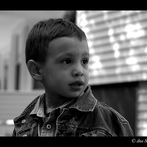
I would like some advice on composition. I like to close up to my subject very close and some time cropping the top of the head just to emphasize the expression of the face. I saw many photographer do this and this is how I like to shoot portrait.

Both photos below are my self portraits with my newborn;

3228537910_df7bdb907e_o.jpg


3228644072_e6746ce98e_o.jpg


A friend of mine always criticize about this style becoz he prefers to have empty space around the subject. Therefore I would like some advice on this please.

Thanks in advance.
 
i think the light may be to strong... it just seems kind of harsh on the subjects... maybe stop it down a few or throw a shoot through umbrella in front of it
 
is it just one light to the left? i think it's cool by the way. it looks dramatic. what did you use for background?
 
I really like the effect the light gives.
These are good.
 
In terms of composition, I'd move them just a tiny bit to the left. You can still leave ample space on the left as negative space, but I think these would be good with a pretty literal interpretation of the the rule of thirds. The second one where the lighted part of his arm actually touches the frame of the image I think needs it more than the first.

Light's a little hot on the child's hand in #2, but I think overall the lighting produces a good effect.
 
is it just one light to the left? i think it's cool by the way. it looks dramatic. what did you use for background?

yes its just one light to the left. for the bg i just use a plain black cloth taped to the wall. apart from providing the black bg i wanted, it helps in absorbing light from other part of the subjects not directly lighted by the light source.
 
I think you need to move your subjects to the left. In the second image, the arm of your subject is touching the edge of the image, thus I think he is in more dire need of being moved left than the first image.
 
The second image would probably benefit from being composed the other way-- the space to the left doesn't really add much because you are looking to the right.
 
ha... I'm in the odd position of having to say to you what everyone said to me when I did lighting like that with my daughters. :)

It looks kinda creepy to me.

Now this is funny because I didn't see this with the pics of MY kids. I thought it just looked kinda cool, but everyone else said it was creepy. I wonder if it's one of those things where you know the kid, so to you it isn't creepy, but to anyone else it is.

I think your baby's expression (particularly in the second one) amplifies the creepiness a bit. Big scay man holding terrified looking baby in scary light.

Dunno.

Still, aside from being creepy it's kinda neat.
 
I DO LIKE the dark shadows in the picture, but not to the point where details of the person itself is hidden beneath them and I think your photos could use just a tiny bit more light.
 
ha... I'm in the odd position of having to say to you what everyone said to me when I did lighting like that with my daughters. :)

It looks kinda creepy to me.

Now this is funny because I didn't see this with the pics of MY kids. I thought it just looked kinda cool, but everyone else said it was creepy. I wonder if it's one of those things where you know the kid, so to you it isn't creepy, but to anyone else it is.

I think your baby's expression (particularly in the second one) amplifies the creepiness a bit. Big scay man holding terrified looking baby in scary light.

Dunno.

Still, aside from being creepy it's kinda neat.

Really :D? I was going to make it "dramatic" and "contrasty". Never thought of it being creepy.. LOL
 
Did you take any pics with the camera in portrait orientation?
 
Looks dramatic to me. I like the way the light strikes from the left, but I think you need to brighten up the right side of the face and maybe use a milder light.
 

Most reactions

New Topics

Back
Top