MommyOf4Boys
TPF Noob!
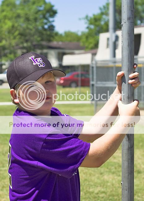
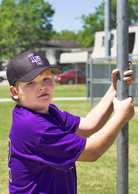
I am just not happy with this photo. I am sure that there can be something done to make the colors really pop, but I am just not doing it right. I do not want the shadow on his face to be too distracting, so when I adjust the levels and do the curves it overdoes his face too much. Please feel free to give it a try or give suggestions!
")


![[No title]](/data/xfmg/thumbnail/41/41820-5b89d2c0ef3c8c232c56fabddbeaee0b.jpg?1619739903)