Portrait practice... opinions please!! xx

jemmy

TPF Noob!
Joined
Apr 17, 2006
Messages
847
Reaction score
0
Location
queensland, australia
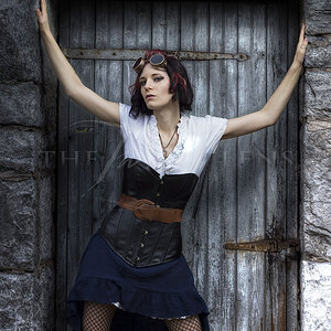
:heart: Hi all, have been busy trying to learn the tricks of PS all day, and mucked around on this pic... It was originally colour, converted to b& w in channel mixer, adjusted levels & contrast, unsharpen mask then tried to 'vignette' using the burn tool!??!!!:blushing: I was rather happy with the results but needed to know what the pros thought xxx LOL PS..how do you know when you have achieved the 'perfect' look?... does a certain histogram mean 'great' or is it all to do with the eye?! xx

rylee.jpg
 
YOu did a great job! FOR Me its a little blurred.. I personally like my pics to be a bit more crisp...
 
Yeah.... maybe that was the unsharpen mask??!! the original seemed crisper xx

Holly said:
YOu did a great job! FOR Me its a little blurred.. I personally like my pics to be a bit more crisp...
 
Can you post teh original?
 
i think you've done great job too. This looks like a vast improvement to me.

Generally speaking on the histogram should have data at both sides (the shadow and highlights) and flow in a peak towards the centre (midtones), without any gaps at either end. Looking at the histogram for your pic it could possibly need the highlight bringing out more, do this in levels (it's the top triangle silder on the right)

great pose too BTW
 
Here is the original holly... OTE! xx and actually now that i look at it, this one is a bit blurred too! What a shocker.... oh well, i'm having a ball learning xx LOL
ryleeoriginal.jpg
Holly said:
Can you post teh original?
 
Hey!

Ok.. Going to tell you what I did... BUT note I used Paint Shop Pro.. You can do these in PS too..

FIrst I add the curves technique.. JUST slightly NOT a lot at all..

Second - I tried some contrast. Just to help him pop away from the wall slightly... Then used the Unsharp mask tool to sharpen up the picture some..

Third I used clone brush to remove the sun light glare from his lip

e79b1848.jpg


My Suggestion for you.. PLAY a while with it.. The only way you are going to learn the PS is to continue to fool around with it and get into it deep.. THere are a lot of great things you can do with it... When you can show us what you come up with! Love seeing your Photography!
 
Christie Photo said:
This is your best post so far. I really like the B&W!

Very nice.

Pete
Ditto! :thumbup:
 
yea the black and white is the best of these edits :thumbup:
 
I think that the B&W version looks great! Not all photos have to be super crisp and crystal clear to look good, especially with kids. I've got to disagree with Holly's edit, because there was so much Unsharp Mask done that it's leaving halos, and very strongly contrasted edges on everything. Keep going the way you are jemmy...your PS tecniques are looking good and not at all "overdone"!
 
bowronfam3 said:
Holly's edit, because there was so much Unsharp Mask done that it's leaving halos, and very strongly contrasted edges on everything.
OUCH! lol Please tell me where there are halos and unsharpened masks that dont look right ??? I Guess this is why you never take tips from more then ONE photographer!! .... Perhaps this is why its called *art* we all like them different ways.. To me her b&w is to blurred for a childs photo! I like to see the expression clear... NOT something Id purchase or be happy with.. (NO Offence JemmY)
 
I disagree Holly. I don't think every photo of a child has to have a crisp look to it. In fact, I rather like the way Jemmy has done her B&W. My eyes stare right at the child's pretty eyes. They seem sharp enough to me.
Please don't take this as being mean, but in yours, the photo has an overall appearance of having too much post processing work done to it.
I think a natural look (even if it is slightly blurry) is preferrable to a picture that looks like it's trying to be "fixed."
 

Most reactions

New Topics

Back
Top