Portrait Session: C&C Desired

WhiskeyTango

No longer a newbie, moving up!
Joined
Jan 12, 2012
Messages
286
Reaction score
41
Location
Michigan (Detroit Metro)
Can others edit my Photos
Photos OK to edit
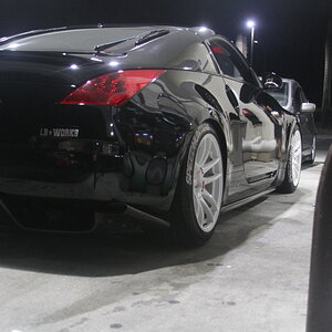
Alright. I've been practicing "duck & cover" for the last hour. Without further ado, I present the following without hope or expecctation, lol.

Let the beatings begin!

1.


2.


3.


Sarcasm aside: I'm genuinely looking for honest feedback. The point of posting these is to learn.
 
The biggest thing that caught my eye was that he's slouching and he looks uninterested in the third photo.
 
Last edited:
Nice pics. White balance appears off or it could be my monitor. The hat whooped you in pic one and shaded the eyes. Black looks under exposed and flat, a dash of fill adjustment may bring back a little
 
Not lovin the third....background is to noisy for me and it looks soft at the eyes....I like 1 and 2
 
1 needs some definition between his black **** and your black background. The shadow from the hat cuttuing across the eyes needs a bit of reflector or something to our right to kill it.
3 your background is a huge distraction along with rex's comments.

Your focus and exposures look good. I had to click into the second & third ones cuz I THOUGHT they were soft, but on your smug mug they're clean. Nice.
he seems to be a bit yellow.

REALLY like 1 & 2. Lose 3. Just makes him look like a deer in the headlight. The background does not flow with his tat's and the shirt/feeling you get from him. Then add in the slouch in the backdrop. you could darken the hell out of the background alone and it might work better!

I have to admit: #3 was my ringer. It's the best of "the worst" from the session. I figured if nothing else garnered comments, it would. :)

These were shot with a large softbox cam left, striplight back camera right, and a reflector front camera right. I definitely need to work on the striplight and reflector placement... I battled with that the whole shoot. I think I'd benefit from shooting tethered, too, cuz the separation looked better in camera...

I "think" the back light needs to move closer and be angled more towards the camera. The reflector needs to be larger and closer to the subject. again: I think.
 
Oh. and all 3 have the same background. The 3rd shot has an additional light 3 feet or so above and behind the subject striking the background. It's gelled with a 1/2 CTO. Background is black on black.
 
The poses in 1 and 2 are good but you lose a lot with him wearing a black hat and the background being dark black as well. Everything is bleeding together and he looks like he is missing part of his head. I think if you had used the background in the last shot in all the shots things would have looked better. Dont like the red shirt. Its not blending well with anything. These also seem like they might be nice black and white. It just seems fitting for this guy or maybe a sepia.
 
Oh. and all 3 have the same background. The 3rd shot has an additional light 3 feet or so above and behind the subject striking the background. It's gelled with a 1/2 CTO. Background is black on black.

I didnt read this until after I posted. lol, I was going to suggest putting a light behind him.
 
1 needs some definition between his black **** and your black background. The shadow from the hat cuttuing across the eyes needs a bit of reflector or something to our right to kill it.
3 your background is a huge distraction along with rex's comments.

Your focus and exposures look good. I had to click into the second & third ones cuz I THOUGHT they were soft, but on your smug mug they're clean. Nice.
he seems to be a bit yellow.

REALLY like 1 & 2. Lose 3. Just makes him look like a deer in the headlight. The background does not flow with his tat's and the shirt/feeling you get from him. Then add in the slouch in the backdrop. you could darken the hell out of the background alone and it might work better!

This forum is doing my photobucket pics like this too.
 
1 needs some definition between his black **** and your black background. The shadow from the hat cuttuing across the eyes needs a bit of reflector or something to our right to kill it.
3 your background is a huge distraction along with rex's comments.

Your focus and exposures look good. I had to click into the second & third ones cuz I THOUGHT they were soft, but on your smug mug they're clean. Nice.
he seems to be a bit yellow.

REALLY like 1 & 2. Lose 3. Just makes him look like a deer in the headlight. The background does not flow with his tat's and the shirt/feeling you get from him. Then add in the slouch in the backdrop. you could darken the hell out of the background alone and it might work better!

I have to admit: #3 was my ringer. It's the best of "the worst" from the session. I figured if nothing else garnered comments, it would. :)

These were shot with a large softbox cam left, striplight back camera right, and a reflector front camera right. I definitely need to work on the striplight and reflector placement... I battled with that the whole shoot. I think I'd benefit from shooting tethered, too, cuz the separation looked better in camera...

I "think" the back light needs to move closer and be angled more towards the camera. The reflector needs to be larger and closer to the subject. again: I think.

Sounds to me doing everything right. You are learning valuable lessons from seeing what happened in this shoot.
yes, your back light would need to be more of a 'hair' light in this scenario. It would be highlighting the outline of the subject and not lighting the backdrop.
With the hat your fill light/reflector to camera right needed to be lower so it is reflecting up underneath the hat.
This is the perfect case scenario for CC!
Just to add on to what MLeeK is saying. Black on black is a little trickier, but with the lighting placement it can be accomplished without floating body parts. Self portraits add another layer of difficulty because ...... well, because their self portraits and you can't see the modeling lights or the immediate feedback on the LCD without getting up and down repeatedly.

I used four lights with this SP, but you could substitute a reflector for the fourth light in front to add some definition on the face. I created a lighting diagram which shows where I placed the lights and how they were metered.

Photo
Diagram
 
First two are pretty good, the third is definitely off. The background really doesn't work for the subject, far too girly, plus as others have said, he's slouching and looks very bored. Definitely add a kicker behind in the first one to separate his black shirt and hat from the background. #2 is my favorite.
 

Most reactions

Back
Top