Navigation
Install the app
How to install the app on iOS
Follow along with the video below to see how to install our site as a web app on your home screen.

Note: This feature currently requires accessing the site using the built-in Safari browser.
More options
You are using an out of date browser. It may not display this or other websites correctly.
You should upgrade or use an alternative browser.
You should upgrade or use an alternative browser.
Portrait Session this past weekend C&C Please!
- Thread starter Rudipides
- Start date


nicholaskong
TPF Noob!
- Joined
- Apr 21, 2014
- Messages
- 20
- Reaction score
- 5
- Location
- Kuala Lumpur, Malaysia
- Can others edit my Photos
- Photos NOT OK to edit
They are all good 
- Joined
- Jul 8, 2005
- Messages
- 45,747
- Reaction score
- 14,806
- Location
- Victoria, BC
- Website
- www.johnsphotography.ca
- Can others edit my Photos
- Photos OK to edit
C&C per req:
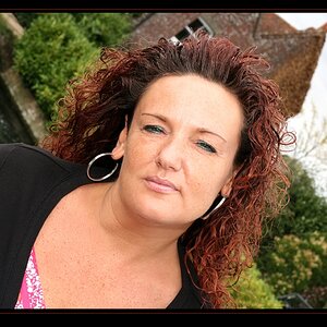
1. The composition is a little too centered for my taste; I would suggest cropping away a good chunk of the RH side and avoid posing people, especially women, square to the camera ("football shouldes"). Also, consider the use of a reflector in cases like this to bring more light onto the face and reduce the highlights on the hair. You definitely want some, but in this case I think you have too much of a good thing.
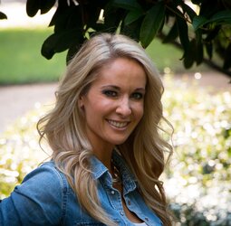
2. This is a nice casual image, but again the eyes are a little dark; fill light whether a flash or reflector would have helped a lot here. Not sure about the 'hands in the pockets' pose. IT seems a little awkward, but the angle of her body is much nicer than in #1.
3. Face is grossly under-exposed. The expression is good, but with all of the bright areas, the eye is pulled away from her as soon as it moves onto the image (remember, the human eye is always attracted to light over dark).
It's a nice set, but a simple reflector or speedlight would have taken these from 'nice' to 'WOW!'.
Just my $00.02 worth - YMMV
~John
1. The composition is a little too centered for my taste; I would suggest cropping away a good chunk of the RH side and avoid posing people, especially women, square to the camera ("football shouldes"). Also, consider the use of a reflector in cases like this to bring more light onto the face and reduce the highlights on the hair. You definitely want some, but in this case I think you have too much of a good thing.
2. This is a nice casual image, but again the eyes are a little dark; fill light whether a flash or reflector would have helped a lot here. Not sure about the 'hands in the pockets' pose. IT seems a little awkward, but the angle of her body is much nicer than in #1.
3. Face is grossly under-exposed. The expression is good, but with all of the bright areas, the eye is pulled away from her as soon as it moves onto the image (remember, the human eye is always attracted to light over dark).
It's a nice set, but a simple reflector or speedlight would have taken these from 'nice' to 'WOW!'.
Just my $00.02 worth - YMMV
~John
abovenormphotos
No longer a newbie, moving up!
- Joined
- Jan 17, 2014
- Messages
- 149
- Reaction score
- 40
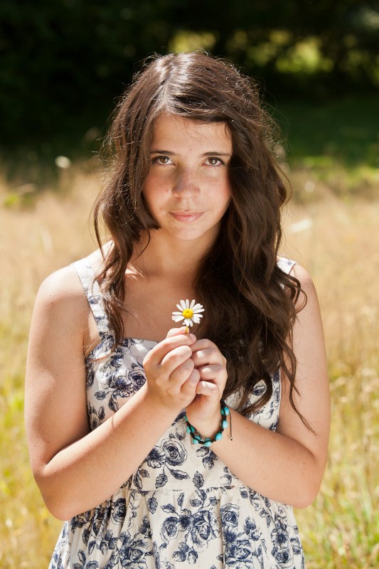
Love no 2. I like the light and shadows. The background is great. But it sorta xUses her hair to get merged into it.
ronlane
What's next?
- Joined
- Aug 3, 2012
- Messages
- 10,224
- Reaction score
- 4,961
- Location
- Mustang Oklahoma
- Website
- www.lane-images.com
- Can others edit my Photos
- Photos OK to edit
C&C per req:
1. The composition is a little too centered for my taste; I would suggest cropping away a good chunk of the RH side and avoid posing people, especially women, square to the camera ("football shouldes"). Also, consider the use of a reflector in cases like this to bring more light onto the face and reduce the highlights on the hair. You definitely want some, but in this case I think you have too much of a good thing.
2. This is a nice casual image, but again the eyes are a little dark; fill light whether a flash or reflector would have helped a lot here. Not sure about the 'hands in the pockets' pose. IT seems a little awkward, but the angle of her body is much nicer than in #1.
3. Face is grossly under-exposed. The expression is good, but with all of the bright areas, the eye is pulled away from her as soon as it moves onto the image (remember, the human eye is always attracted to light over dark).
It's a nice set, but a simple reflector or speedlight would have taken these from 'nice' to 'WOW!'.
Just my $00.02 worth - YMMV
~John
^^This, but I don't mind the composition in #1 as much as John. I would rate the #2, #1 and then #3 (it needs more exposure.). I can see that she would like them.
vintagesnaps
Been spending a lot of time on here!
- Joined
- Jan 13, 2013
- Messages
- 9,119
- Reaction score
- 3,109
- Location
- US
- Can others edit my Photos
- Photos NOT OK to edit
John's spot on with his critique, he knows his stuff. I think the first two have a little more background than you need. The first one is lovely but I'd crop some, and I'd look at the bottom of the photo. I would have either had her roll the sleeves down a bit or framed a little differently to not get just the edge of her skin below the sleeve, that seems to make her seem cut off.
I like the second background too with her in denim, but vignetting to me seems to give a feeling of being closed in; again I'd just crop it some but it does look nice and straight which is something to watch for I find with geometric backgrounds (brick, stone, wood etc.).
I find the lighting in the third can be tricky if your camera's metering for the bright light off in the distance. I usually lower the camera and meter for the area that's say maybe several feet in front of me that I'll be photographing and then reframe. I sometimes too will bracket shots (although I do that more often if I'm shooting B&W film) to get a photo according to the meter reading, then one with the exposure increased by one setting by adjusting either shutter speed or aperture, then another with the exposure decreased by one. (If that makes sense! lol)
These are nice photos, just some adjustment might make them a bit better.
OP
OP
Rudipides
TPF Noob!
- Joined
- Jul 17, 2014
- Messages
- 39
- Reaction score
- 8
- Location
- Louisiana
- Can others edit my Photos
- Photos NOT OK to edit
@Vintagesnaps Thanks for the advice. I didn't even think about the sleeves in #1. #3 was totally bad exposure on my part. I will definitely try your idea of metering several feet in front of me. Good advice.
Pejacre
No longer a newbie, moving up!
- Joined
- Jun 20, 2014
- Messages
- 308
- Reaction score
- 101
- Location
- North Wales, UK
- Can others edit my Photos
- Photos OK to edit
Everything John said - perfect critique. Just to add I really love the choice of bg in 2.
Last edited:

ruggedshutter
No longer a newbie, moving up!
- Joined
- Mar 22, 2012
- Messages
- 146
- Reaction score
- 33
- Location
- North Carolina, United States
- Website
- www.ruggedshutterphotography.com
- Can others edit my Photos
- Photos OK to edit
These turned out great, good job! The only thing that I would change that hasn't been addressed is on number 2. I would have gotten a little more separation between her and the background. It would have kept the same feeling but it would have allowed her to pop out from the background more by getting the rock-work out of focus. Great job
vintagesnaps
Been spending a lot of time on here!
- Joined
- Jan 13, 2013
- Messages
- 9,119
- Reaction score
- 3,109
- Location
- US
- Can others edit my Photos
- Photos NOT OK to edit
That's nice, brings the attention more to her. I might make copies and experiment with various crops; for women with long hair usually I wouldn't want to see the ends of the hair cropped, but with the pockets of the denim it's probably a judgement call. I like the background choice because her blond hair looks good against the color so I don't know if I'd want to lose a lot of that. You could probably do more than one version of this portrait and get some nice choices.
Derrel
Mr. Rain Cloud
- Joined
- Jul 23, 2009
- Messages
- 48,225
- Reaction score
- 18,941
- Location
- USA
- Website
- www.pbase.com
- Can others edit my Photos
- Photos OK to edit
For the most part the adjusted shoot looks good. You have all the ingredients needed for a good outdoor portrait, except one: fill light and the accompanying trait that I refer to as "eye sparkle", meaning something to draw our eyes to HER eyes, that's the main missing ingredient. Here is what a single 4x6 foot white reflector panel on a PVC frame can do in basically the same, exact type of outdoor backlighting in sunshine conditions.
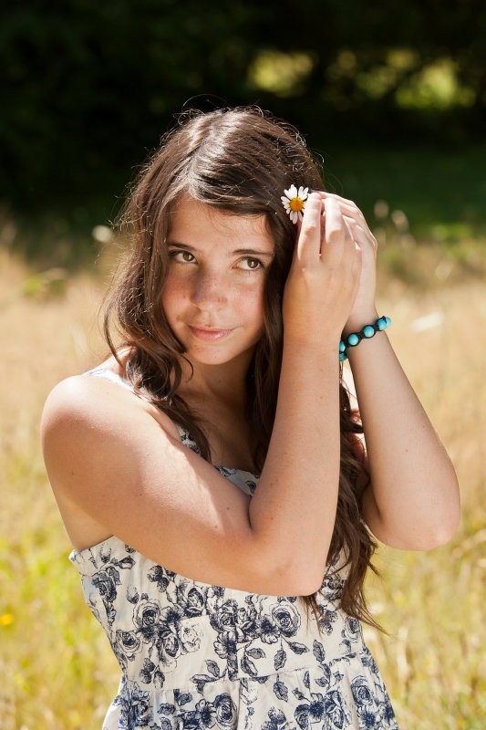
[ D3X_3124_1800x.jpg photo - Derrel photos at pbase.com ]
What the reflector has done is it has brought the shadow-side, her face and body, "up" and closer to the highlight exposure, so I do not have really badly burned-out highlights. YES, I let the hand, which is in a shaft of strong sunlight, go hot, but that's okay, since the hand is actually placing the flower in her hair, and so that makes sense. But you can see, the big 4x6 foot tall reflector is really making here beautiful brown eye color show up, plus she has BIG catchlights in her eyes, which further emphasize her sideways glance. Her non-makeup skin also has a nice, attractive glow to it, due to the very softly diffused highlight the reflection of the BIOG panel makes on her face, as it throws a ton of sun back, and into what were shadowy areas.
I think reflector fill light is the easiest way to work during the spring, summer, and fall. Easier than flash. More versatile than flash. More subtle than flash. But either one can give that "eye sparkle" look, and can throw some light into the eye sockets and the face.
[ D3X_3113_1800x.jpg photo - Derrel photos at pbase.com ]
As Tirediron mentioned above, this is just, "a simple reflector," used under similar lighting conditions outdoors.
JacaRanda
Hobbyist Birdographer
- Joined
- Mar 20, 2012
- Messages
- 5,472
- Reaction score
- 2,628
- Location
- Orange County California
- Can others edit my Photos
- Photos OK to edit
Well, what they said
Watch the backgrounds especially something immediately behind the head. I could care less about the leaves behind her, but a photo critic may. Perhaps either of you moving a tad to her right or your right may have taken the leaves out of play.
#3
Watch the backgrounds especially something immediately behind the head. I could care less about the leaves behind her, but a photo critic may. Perhaps either of you moving a tad to her right or your right may have taken the leaves out of play.
#3
Last edited:
Pejacre
No longer a newbie, moving up!
- Joined
- Jun 20, 2014
- Messages
- 308
- Reaction score
- 101
- Location
- North Wales, UK
- Can others edit my Photos
- Photos OK to edit
Crop is better apart from chopping the hair but as Derrel says, fill light and eye sparkle missing - also the blown highlights in the hair distract from what's otherwise a lovely shot.
Most reactions
-
 460
460 -
 291
291 -
 284
284 -
 258
258 -
 218
218 -
 202
202 -
 192
192 -
 184
184 -
 180
180 -
 167
167 -
 153
153 -
 137
137 -
 118
118 -
I
111
-
 102
102
Similar threads
- Replies
- 8
- Views
- 188