Portraits - C&C

Laika

TPF Noob!
Joined
Feb 19, 2008
Messages
165
Reaction score
0
Location
Ohio
Can others edit my Photos
Photos OK to edit
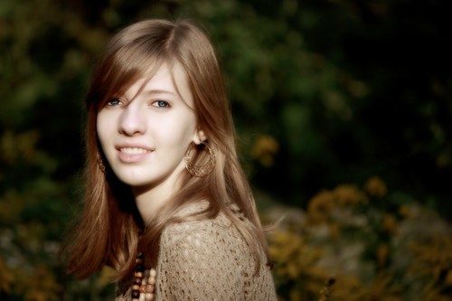
I really could use some harsh c&c on these - I feel like I have hit a little bit of a road block in my gradual improvement. I'm not afraid of critique!

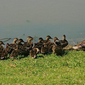
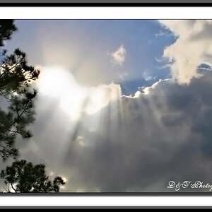
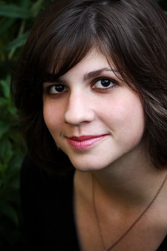
All are shot with natural light:

1.

3999798968_baca2a41c9.jpg


2.
3960247405_396c68c58d.jpg


3. This one has an unusual editing style, is it working for you or is it too odd for a portrait?

3963452556_b19628101a.jpg
 
very nice, I like the last one the best. I think the first one would be a bit better im the light were more even through out the image.
 
I like the first one the best...I do wish her right side wasn't as dark, but at least it adds dimension to the photo. =)

Personally, I like the last one the least...I'm not so fond of the processing. The midnight sepia look was really trendy 2 years ago, but I'm just not so fond of it. But...processing is all about personal choice, so if you like it, that's great! =)
 
Last edited:
I think n°1 is the best, it has good sharpness and colors (maybe a tad saturated... depends on taste)

n°2 has a blown-out sky, which is my main complaint... I like that action style, gives movement to the picture :D

n°3: the pp doesn't work for me, but it's a personnal taste, sorry
 
I think photo 1 has slightly awkward framing, and would have looked better with the camera swung a bit to the right, so that there would be a bit of her dark sweater in the lower right hand corner, to help anchor that. I think it would have looked much better from a perspective point of view to have used a longer focal length and moved the camera to at least double the distance, since the close-range shot is making her nose look exaggeratedly large. The V-neckline of the sweater is pushing the viewer's eyes down,and right out of the frame. Framing this a bit more loosely, with some sweater at the bottom, might have helped the shot considerably. Good focus though, and nice bright eyes. SImple foliage backdrop, so points for those things.

To me, the second photo, while it might be a bit overexposed, is by FAR,and I mean by far, the absolute best shot. You have captured her at the peak of her jump, and yet there is a little bit of foot motion blur, the repeating shadows look good, and the composition is pretty solid. Sure, the highlights are a bit blown, but maybe it could be post-processed a bit more to massage the photo into a slightly better technical image, but overall, I LIKE the shot. It's fun! It has dynamic action. Technically a 7, emotionally a 9.

The third shot...my pet peeve #1...horizontal framing on a vertical subject that is far,far taller than it is wide. Her angle to the camera is also poor. Had you turned the camera to portrait orientation and brought her right shoulder around about 30 to 45 degrees, she'd have two shoulders, and a bustline,and the shot would be solid, and the portrait orientation of the camera would have eliminated that big, black area of dead space in the back right hand side of the frame. The processing looks okay to me--soft, slightly ethereal and diffused. Her wardrobe and necklace harmonize with her hair, makeup, and everything, but we literally can't "see" much necklace or wardrobe, just one shoulder's worth of sweater. This extremely side-angled positioning of the body is not very flattering,and leads to just a head, floating on top of a single shoulder.
 
Last edited:
Thank you all for the critique - special thanks to you Derrel for spending the time to write in such detail!

What is a good focal length to shoot portraits? #1 was shot at 84mm. Would 100 be better, or should I go all the way up to 200mm? I still haven't gotten all of that figured out.
 

Most reactions

New Topics

Back
Top