portraits

moo

TPF Noob!
Joined
Jan 5, 2007
Messages
13
Reaction score
0
Location
Valencia, Spain
Can others edit my Photos
Photos OK to edit
Hi everybody!

I'm pretty new here. My first thread was posted yesterday, just to say hello and introduce myself ;)

As I told you there, I like photography since a long time but still got too much to learn in this field. I'm very critical with my work so I would love to get other people opinions and comments.

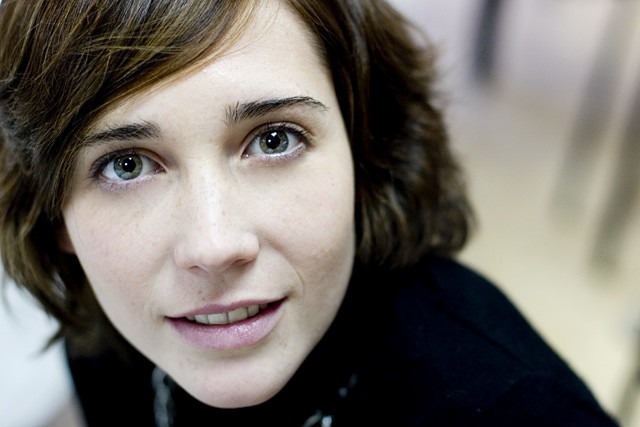
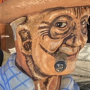
Just for a start, I will bring you the latest portraits I've done with my new lens (50mm/1.4) just getting used to it and playing with DOF possibilities.

Thanks for your comments and help! :)

336025963_bdefce2303_o.jpg


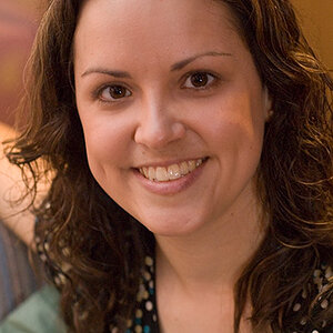
1/60, f 1.6 ISO 200 50 mm

336049760_a033083c90_o.jpg


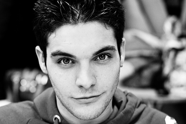
1/80, f 2.2 ISO 200 50 mm

335427680_d5c3cc4a17_o.jpg


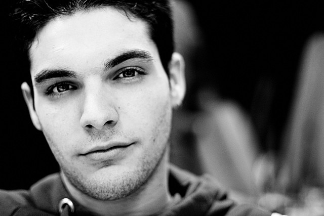
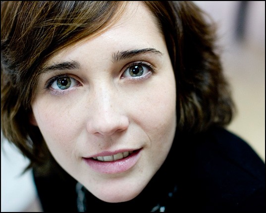
1/160 f/1.8 ISO 200 50 mm
 
Wonderful. I saw these and never commented because I went to search the web for prices for the 1.4 50mm lens (but I fear it might still be too expensive for me).

In the first, I miss a bit more of his forehead, though I am not against portrait compositions that have the face fill the frame and go beyond. But I think 1 is a bit unbalanced, while 2 is not. Her eyes are worked out ever so well there! Nice interaction with the viewer, and the partial disaturation (other than on her eyes?) is good! Interesting! Very good work.

The last makes me ever so curious to see what the little girl is doing there, but there is this blurred object in the front, making it a secret...

Hi LaFoto :)

The lens is a X'tmas present ;) and I am incredibly happy with it :roll:

Thank you for your comment and it is great that you think it is interesting. Those portraits were taken during a lunch and had no many interesting angles to try. About the first one, I tried two different shots. I chose that one because I think it is a little harder (specialy his defiant look), and like expresions that transmit feelings. Here I show you the other I took (which I think is more common)

336051647_a7dc7bbb0b_o.jpg


The girl on the last one is reading a book and that object out of focus in the front is just the pages of the open book! :D

Thank you so much for your opinion!! :)
 
Hey, while his expression might be more defiant in the first, I really like the way you worked out his eyes in the second! It might be more common, but I do appreciate the amount of light in his eyes. Is it your brother then?
 
I much prefer the second photo of the male subject. His pose may be better in the first, but he's much more expressive in the second. He has a mischievous look about him that piques the viewers' interest. It also has a better DOF, in my opinion. The OOF ears in the first photo were very distracting, and felt detached from the rest of the composition. This second photo feels much more complete, and the eyes are much more interesting. The eyes in the first photo are almost black and very flat. In the second, the iris is much more defined, and the catchlights make them seem more alive.
 
It could use a crop off the right, but I love that second shot. Your model is beautiful and you captured her well.
It also looks like you saved them in the AdobeRGB color space, which ends up looking faded when shown in a browser. When saving a JPG for web, trying converting to (not assigning) the sRGB color space.

Here's the same image converted to sRGB with a crop:

336049760_a033083c90_o-copy-mod1.jpg


And here it is with some red and yellow added to counter the cool light:


336049760_a033083c90_o-copy-mod2.jpg
 
Hi moo, welcome to the forum. I really like the last two pictures you posted.
markc nice edits, the second photo looks really good.
 
Hey, while his expression might be more defiant in the first, I really like the way you worked out his eyes in the second! It might be more common, but I do appreciate the amount of light in his eyes. Is it your brother then?

Yes, the light in the eyes is much more better in that second one. I guess it is a better portrait (better done) but I still like the first one. I do like different and hard portraits more than the usual ones....

And no. He is not my brother, but you were close ;). He is one of my cousins.

I much prefer the second photo of the male subject. His pose may be better in the first, but he's much more expressive in the second. He has a mischievous look about him that piques the viewers' interest. It also has a better DOF, in my opinion. The OOF ears in the first photo were very distracting, and felt detached from the rest of the composition. This second photo feels much more complete, and the eyes are much more interesting. The eyes in the first photo are almost black and very flat. In the second, the iris is much more defined, and the catchlights make them seem more alive.

Yes, you are right too. I'm already kind of convinced :D. Will look at the second one a bit more :) Thank you so much for your opinion!

It could use a crop off the right, but I love that second shot. Your model is beautiful and you captured her well.
It also looks like you saved them in the AdobeRGB color space, which ends up looking faded when shown in a browser. When saving a JPG for web, trying converting to (not assigning) the sRGB color space.

Hi markc! Thank you so much for your interest in that second picture. She has a great look than makes you "go in" her eyes. That is the strength of the picture.

About the color space, when saving for web I always mark the option ICC profile so the colours should remain the same. My original picture is not different from the one posted here. I kept those smooth colours as she has a very white skin. In any case, I also like your second example with some more red and yellow. Thanks!

About the crop, I did not want to center all the attention in her face. I wanted to show some depth of field playing with the diagonal of her head and shoulders and the out of focus behind her (hard for me to explain this in english, sorry)

Thanks again!

Hi moo, welcome to the forum. I really like the last two pictures you posted.
markc nice edits, the second photo looks really good.

Hi oCyrus55. Thank you for your welcome ;) When you say that you really like the last two picture I assume you mean the one with the little girl reading and the second one of the boy, right? Thank you!
 
About the color space, when saving for web I always mark the option ICC profile so the colours should remain the same.
That doesn't always work as expected. The image has the AdobeRGB profile embedded in it, but that doesn't help. Browsers ignore it and just use sRGB to display, no matter what profile is embedded. That's why you have to convert. The colors don't match up and will look dull.

My original picture is not different from the one posted here.
Are you sure? You may not be noticing the difference if you aren't used to judging color. My Photoshop says your image posted here is in AdobeRGB. I would have thought that your original would look like the first one I posted. I didn't do anything to it color-wise other than convert it to sRGB, which is what browsers use. If that's not the case, then there's something strange in your software's color set-up that might cause problems if you try to print.


About the crop, I did not want to center all the attention in her face. I wanted to show some depth of field playing with the diagonal of her head and shoulders and the out of focus behind her (hard for me to explain this in english, sorry)

I think I understand. The reason I cropped the background is that I got the DOF effect from what I left of the background. What I cropped out wasn't adding anything more for me. It was just more of the same. It also felt that she was on one side of the image, and the background was on the other side. This felt very unbalanced to me. For me, the image is about her eyes, and that right side was stealing me away from them. It's really just a suggestion, and people are going to have different opinions on it.
 
I think I understand. The reason I cropped the background is that I got the DOF effect from what I left of the background. What I cropped out wasn't adding anything more for me. It was just more of the same. It also felt that she was on one side of the image, and the background was on the other side. This felt very unbalanced to me. For me, the image is about her eyes, and that right side was stealing me away from them. It's really just a suggestion, and people are going to have different opinions on it.

A suggestion that I really appreciate :). Sure people will have different opinions, and that is what makes this world interesting, those different opinions so we can compare, we can learn and we can enjoy. And I do like your version. In any case, and once you know my style a little more, you'll see that I use to choose difficult angles and uncommon compositions. I was thinking of posting one self-portrait that matches the idea I'm talking about now and would explain what I mean better than with words. But I am a little confused with the right place for the pictures. I posted this thread of portraits here as I thought that all pictures related to "people" had to be posted here. But now I see there is another place for portraits so maybe I should put it there....

That doesn't always work as expected. The image has the AdobeRGB profile embedded in it, but that doesn't help. Browsers ignore it and just use sRGB to display, no matter what profile is embedded. That's why you have to convert. The colors don't match up and will look dull.

You may not be noticing the difference if you aren't used to judging color. My Photoshop says your image posted here is in AdobeRGB. I would have thought that your original would look like the first one I posted. I didn't do anything to it color-wise other than convert it to sRGB, which is what browsers use. If that's not the case, then there's something strange in your software's color set-up that might cause problems if you try to print.

I will check it, then. Thank you for the advise!! :)
 
I like the second one of the boy better.

I like markc's addition of the yellow to the one of the lady, though it was already great as-is. She has stunning green eyes, and you did a good job of capturing them. I do like it with a bit cropped off the right though.

#3 is perfect as-is. Very well done. I hope I can make portraits like that some day.
 
Yeh, I really like the second one of the boy and the girl reading.
 
ShootHoops, notelliot, thanks a lot! :)

I like the second one of the boy better.

I like markc's addition of the yellow to the one of the lady, though it was already great as-is. She has stunning green eyes, and you did a good job of capturing them. I do like it with a bit cropped off the right though.

#3 is perfect as-is. Very well done.

Great that you like them!

About the crop, I aways keep the format that comes from the camera (I mean in size, in this case 32x21 cm). In this case I did no crop at all as the composition did not work cropping with that size without losing part of her face.

I hope I can make portraits like that some day.

What a nice compliment! :blushing: thank you!
 

Most reactions

New Topics

Back
Top