Navigation
Install the app
How to install the app on iOS
Follow along with the video below to see how to install our site as a web app on your home screen.

Note: This feature currently requires accessing the site using the built-in Safari browser.
More options
You are using an out of date browser. It may not display this or other websites correctly.
You should upgrade or use an alternative browser.
You should upgrade or use an alternative browser.
pretty ladey in a park photoshoot
- Thread starter rknrl
- Start date
- Joined
- Nov 3, 2007
- Messages
- 1,951
- Reaction score
- 989
- Location
- BDA Native now in NoVA/D.C.
- Website
- jonobrands.com
- Can others edit my Photos
- Photos NOT OK to edit
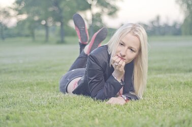
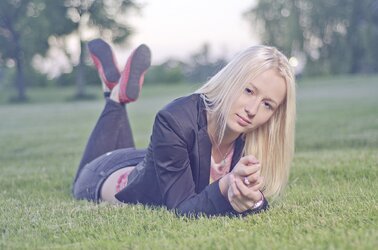
A smile should would go a long way, imo...though 5 & 6 are almost hinting at a smile, the washed out look I am not personally into, the horizon line in 6 is bugging me too.
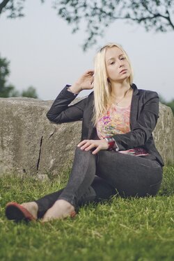
I will say, the shots are pretty crisp and the poses aren't bad, #4 seems the most eye appealing to me, color wise. It's not washed out, nice dof, and good detail and the shadow on her neck really frames her jawline nicely.
Just my humble $.02.
I will say, the shots are pretty crisp and the poses aren't bad, #4 seems the most eye appealing to me, color wise. It's not washed out, nice dof, and good detail and the shadow on her neck really frames her jawline nicely.
Just my humble $.02.
tecboy
No longer a newbie, moving up!
- Joined
- Feb 17, 2012
- Messages
- 2,977
- Reaction score
- 358
- Can others edit my Photos
- Photos OK to edit
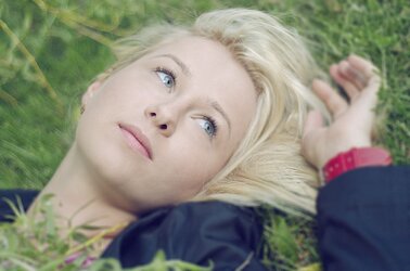
1,5,and 6 need a little bit more of contrast. I notice the jacket on 2 has different color from other photos. Could be the color temperatures are differences. Hope that's help.
cgipson1
TPF Noob!
- Joined
- Aug 18, 2011
- Messages
- 17,142
- Reaction score
- 4,350
- Can others edit my Photos
- Photos NOT OK to edit
Why such low contrast? It looks like you kicked up saturation, and then lowered contrast to compensate. Just makes them look washed out.
Pretty girl... but her expressions are kind of meh! I guess it depends on what you were after...
Pretty girl... but her expressions are kind of meh! I guess it depends on what you were after...
rknrl
TPF Noob!
- Joined
- May 15, 2013
- Messages
- 42
- Reaction score
- 5
- Location
- Toronto
- Can others edit my Photos
- Photos OK to edit
thanks guys.. yeah i wanted to go for a dreamy sort of look and it turned out to be looking washed out i guess. but yeah i ll try to fix this contrast issue
i actually added a warming filter to some of the photos after i posted them here..
for #4 i had two lights going that's why it looks a lot sharpe
i actually added a warming filter to some of the photos after i posted them here..
for #4 i had two lights going that's why it looks a lot sharpe
robertwatcher
TPF Noob!
shot this the other day. cc is always welcome
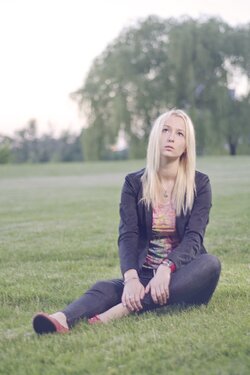
I have no problem with the washed out colours - that is your artistic choice (if that is what you intended) and shouldn't matter to anyone else. As for the lack of smiles - that isn't a problem for me either. The biggest thing that struck me when I first opened the post was first the awkward posing and secondly the flat lighting.
Does that mean that you or the "lady" won't be happy? Probably not. Nevertheless, you may want to hunt around the web and look for some good (and I only pick FREE) tutorials, that will guide you in the right direction when it comes to improving with effective and natural posing - as well as how to put better control lighting.
I'm not one who cares much about the current trend for everything having shallow depth of field - - - but a learned skill is watching what is in the background, and adjusting your position or your subjects to best advantage. Really just the first image appears like the big tree is a headdress with the trunk growing out of the top of her head. Super shallow DPF may have minimized that but a slight adjustment in position, would have been better. While it isn't a problem - the "Christina Aguilera" pose on the last 2, have been overdone too much over the years for my taste. But that's just personal.
Nice job overall. :thumbup:
Last edited:
grandpa_chris
TPF Noob!
- Joined
- Jun 12, 2013
- Messages
- 12
- Reaction score
- 8
- Location
- Midwest
- Can others edit my Photos
- Photos OK to edit
I agree with the other comments about contrast and color variability. Maybe the contrast is stylistically something you were after but since the color (white balance) is inconsistent I suspect it wasn't intentional. I looked at your EXIF data and you had the camera set to auto white balance which would explain inconsistent color. You have mixed light in these photos and in-camera auto white balance can't get the color right with one source; with more than one source I think it's fair to say you have a 100% guarantee of software error for every exposure.
She's a pretty young woman: I adjusted the color balance in one shot for her skin tones and raised the contrast -- see what you think.

She's a pretty young woman: I adjusted the color balance in one shot for her skin tones and raised the contrast -- see what you think.

tecboy
No longer a newbie, moving up!
- Joined
- Feb 17, 2012
- Messages
- 2,977
- Reaction score
- 358
- Can others edit my Photos
- Photos OK to edit
If you want dreamy look, you can get diffusion lens filter, or you can edit in photoshop.
Gavjenks
TPF Noob!
- Joined
- May 9, 2013
- Messages
- 2,976
- Reaction score
- 588
- Location
- Iowa City, IA
- Can others edit my Photos
- Photos OK to edit
In #1-4 she looks bored to absolute tears.
#5-6 have interesting expressions.
#5-6 have interesting expressions.
tecboy
No longer a newbie, moving up!
- Joined
- Feb 17, 2012
- Messages
- 2,977
- Reaction score
- 358
- Can others edit my Photos
- Photos OK to edit
I kinda agree with Gavjenks, 1-4 look like a manikin or a doll.
sarah_19_nz
No longer a newbie, moving up!
- Joined
- Apr 1, 2013
- Messages
- 411
- Reaction score
- 148
- Location
- New Zealand
- Can others edit my Photos
- Photos OK to edit
#2 is my fav, its a little more contrasty and not soooo washed out. I like her eyes in that one too. I'm not a HUGE fan of the washed out look, but I think it has it's place, perhaps here for me it's a little too washed out.
JoeLeBean
TPF Noob!
- Joined
- Jun 9, 2013
- Messages
- 130
- Reaction score
- 14
- Location
- Shipley, West Yorkshire, UK
- Can others edit my Photos
- Photos OK to edit
On 1 and 4 she really look bored, in 5 and 6 the light really distract me maybe because the colours are washed.
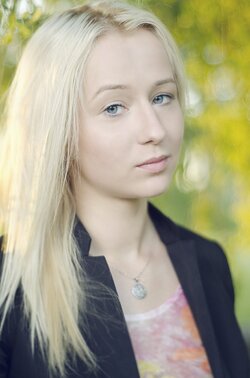
2 and 3 are nice but still I would have liked number 2 reframed to have a bit more space and to put her eyes into a third. Right now they are too much in the middle.
Number 3, with a little smile, would have been a splendid shot.
Out of all of them number 2 is my favorite because I really like the angle and the depth of field (or blur when editing..i'm not good technically to find out...) you used. The model looks more lively.
Hope it helps.
Most reactions
-
 428
428 -
 290
290 -
 285
285 -
 271
271 -
 221
221 -
 204
204 -
 185
185 -
 179
179 -
 167
167 -
 166
166 -
 148
148 -
 133
133 -
 120
120 -
 95
95 -
I
94
Similar threads
- Replies
- 4
- Views
- 416
- Replies
- 0
- Views
- 132

![[No title]](/data/xfmg/thumbnail/32/32007-77c44b6b6edb5db977381096a2ffe54b.jpg?1619735151)
![[No title]](/data/xfmg/thumbnail/36/36644-d48bde7a35945a119c05c18e8c748c27.jpg?1619737671)
![[No title]](/data/xfmg/thumbnail/32/32006-4103e122cb8d7b8d8e41a423124446b7.jpg?1619735151)