vipgraphx
No longer a newbie, moving up!
- Joined
- Dec 1, 2011
- Messages
- 2,415
- Reaction score
- 440
- Location
- Some Where In the Desert
- Can others edit my Photos
- Photos OK to edit
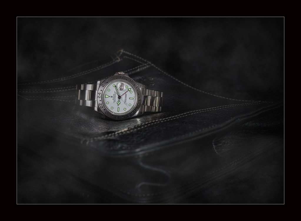
Hello all- been a while since I posted anything. I have been tryout product photography and would like to share with you some photos and opinions and critiques are always welcome
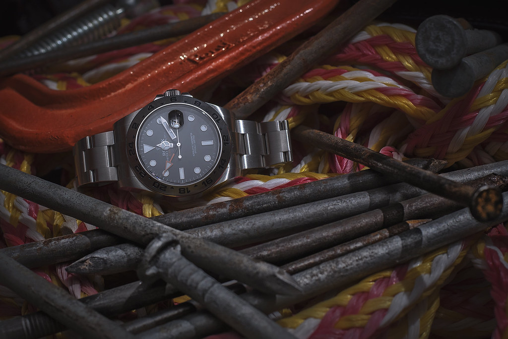 216570 by VIPGraphX, on Flickr
 expsmky2 by VIPGraphX, on Flickr
 exp ice 1 by VIPGraphX, on Flickr
 exp ice 1a by VIPGraphX, on Flickr
 explorerIIF7 by VIPGraphX, on Flickr
216570 by VIPGraphX, on Flickrexpsmky2 by VIPGraphX, on Flickrexp ice 1 by VIPGraphX, on Flickrexp ice 1a by VIPGraphX, on FlickrexplorerIIF7 by VIPGraphX, on Flickr")
 Watch01-3

![[No title]](/data/xfmg/thumbnail/36/36665-7c494bf98537fba5ac87ac5ad6bda658.jpg?1619737676)
![[No title]](/data/xfmg/thumbnail/36/36664-a1f71b488f6761523649a87f8465fc3d.jpg?1619737676)