promised him prints

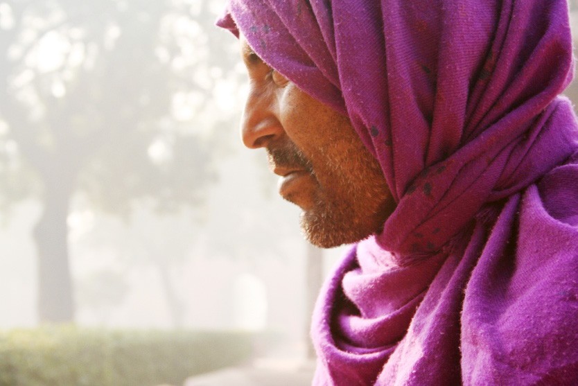
welcome! and i think your did a great job..the first shot is my favorite... love the way yours looks so exotic..and the back ground behind the guy, has an eerie indistinct touch to it...love yours best...

do like airics version too.... for some reason, the desat version to me is better than the over-colored others....

good job! keep posting...
 
hey photgal...nice to see u again....yes i hope i shoot more of such stuff....thx for seeing..
aprilraven - i also liked the one ur talking bout but all of them have done such amazing work that i just love all...all u ppl r awesomeeeeeeee........
:)
 
Raymond J Barlow said:
They are wonderful shots Kunal, and your kind disposition has made this thread a pleasure to read. The people who have helped you in here are awesome, and I really like the efforts they have made to help you.. well done everyone, but I must say JonK has made the most appealing rendition of your first shot., giving it good balance overall., imo

PS is a great tool, and can make a incredible difference in photos, but it take a lot of time and practice to learn to use it, and end up with good results.

You will learn to develop an "eye" for post image work, as I am now., and it is great fun! Welcome to TPF, and good luck with your exhibition!

I agree... nice job!
 
i agree, JonK has offered an excellent revision.

thanks KunalShingla for the opportunity to try my b&w on your awesome images!

50877607-O.jpg


50877040-O-1.jpg


50877042-O.jpg
 
thx guys..i loved this experience...i hope i can post better stuff next time...thx everyone
jonMikal- like ur BW photos man...good work......but again......i am missing the PINK....:-( hehehe
thx everyone
 
I think JonK hit it with his version, including the crop. One of the things that can really throw off how a image looks onscreen is how differently monitors are calibrated.

AIRIC's versions look pretty cool, too.
 
hey, who said it's all over? i'm sure we can get some more editing here, why stop such a fun!?

But ok, ok... we don't wanna complicate Kunal's life...

Sooooooo, *drum roll* My dear Kunal, i think it's time you pick your fave and give out the trophy!!!
 
What the heck. I'll join in and post one, too.
IMG_0168-mod.jpg


I find that using levels and curves to adjust contrast works a lot better for me than a "contrast" adjustment. This might still be a bit too strong, but I didn't spend much time on it.

I'd probably also crop some off either the left or the right. Right now, his facial features are right in the middle of the frame. It seems counter-intuitive, but that usually results in an unbalanced feel.

Nice work, Kunal.
 
Let me first say, that all three of your images are very nice. They could easily stand on their own, but it's always nice to see how others view your work and what changes or improvements they would make. I think a lot of it comes down to personal preference.

So, I gave it a whirl too ;) This was my favorite image out of the series. I pretty much agree with what has been said and followed the same basic guidelines. I also tried to emphasize the fog. But, I also tried to put the primary focus back on the man without adding to much color to draw your attention to him. It's no better than anything that's been posted, just another attempt to give you yet another choice. Good job to you for having such an open mind and letting us attempt to help you improve an image :thumbup:


51106039-L.jpg
 

Most reactions

Back
Top