Promo stills for 'Tommy' - which one and why?

tirediron

Watch the Birdy!
Staff member
Supporting Member
Joined
Jul 8, 2005
Messages
45,747
Reaction score
14,806
Location
Victoria, BC
Website
www.johnsphotography.ca
Can others edit my Photos
Photos OK to edit
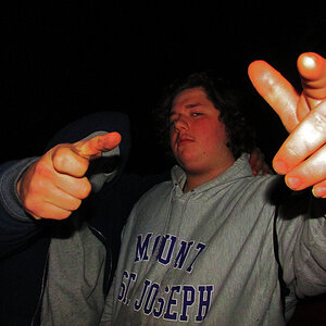
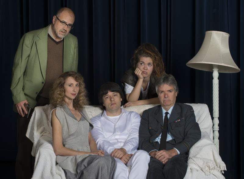
Doing the production & promo stills for a local semi-professional version of Tommy by 'The Who'. Sunday's shoot was to get the promo stills for the upcoming pre-opening party at a local club. The idea was to showcase the lead cast members in a 'dysfunctional family photo' style.

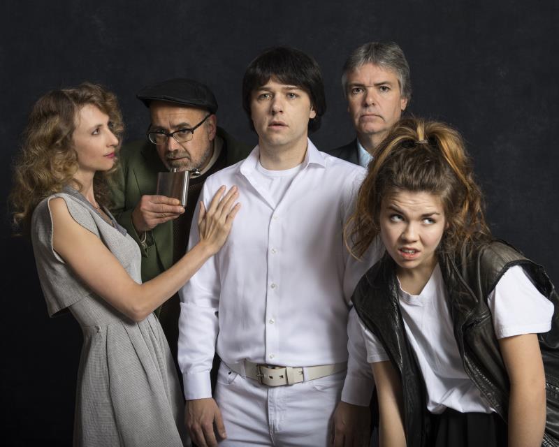
One of the images below is my idea, the other was the idea of the publicist (I'll tell you which idea was which later on! ;) ).

I'd like to hear from you which you prefer and why.


1.
Tommy%20%281%29.jpg


2.
Tommy%20%282%29.jpg
 
I think photo 2 is a little better at showing a dysfunctional family.

The guy drinking helps sell the idea.

Photo 1 is pretty good as well, but I definitely like photo 2 better.
 
I like #2.

If the family really is dysfunctional, then they're probably not going to sit together for a photo.
 
#2 because people never look good sitting.
 
I think photo 2 is a little better at showing a dysfunctional family.

The guy drinking helps sell the idea.

Photo 1 is pretty good as well, but I definitely like photo 2 better.
Thanks!

I like #2.

If the family really is dysfunctional, then they're probably not going to sit together for a photo.
Good point
I would vote for the second one as well. I feel that the posing and composition is just stronger (my opinion only).
Thanks, Ron.
#2 because people never look good sitting.
:lol: That was, in part, the point

So, my idea was #1, and #2 was the PR director's. I liked #1 because the couch with the messy throw and the askew lampshade, "perfect" Mom, bored kids, etc, looked to me like so many family snaps from the 50s & 60s. Oh well... back to the drawing board! :(
 
Late to the party, but I would have said #1. #2 seems they are trying too hard.
#1 the alcoholic still has his drink but subtle. Sitting together on the couch shows how much at least the guys hate to be that close to each other - uncomfortable. The lady with her hand touching someone seems to care - does not give me dysfunctional feel.
 
Last edited:
Just throwing this out there. Jazz hands.
 
Yeah, I'm with Jaca. The first one reads "dysfunctional." The cues are more subtle: the flask, the mother's perfect posture, the dead look in the son's eyes, the defeated slump of the father's shoulders.

The second one shows a broken dynamic, but differently and, imho, not always successfully. The flask right at his lips is too forced, as is the look on the girl's face. The mother with her hand on the son looks totally creepy and borderline incestuous. And the father is just thrown in the back almost randomly.
 
Late to the party, but I would have said #1. #2 seems they are trying too hard.
#1 the alcoholic still has his drink but subtle. Sitting together on the couch shows how much at least the guys hate to be that close to each other - uncomfortable. The lady with her hand touching someone seems to care - does not give me dysfunctional feel.
Thanks! My thinking exactly.

Yeah, I'm with Jaca. The first one reads "dysfunctional." The cues are more subtle: the flask, the mother's perfect posture, the dead look in the son's eyes, the defeated slump of the father's shoulders.

The second one shows a broken dynamic, but differently and, imho, not always successfully. The flask right at his lips is too forced, as is the look on the girl's face. The mother with her hand on the son looks totally creepy and borderline incestuous. And the father is just thrown in the back almost randomly.
:D Okay, so I wasn't totally off base. *Breathes a sigh of relief*
 

Most reactions

New Topics

Back
Top