Rachael B/W

pixilstudio

No longer a newbie, moving up!
Joined
Aug 15, 2011
Messages
372
Reaction score
52
Location
denver co
Website
www.pixilstudio.com
Can others edit my Photos
Photos OK to edit
CC welcome
please comment on the lighting im still learning
Shot with alien bees with beauty dish umbrella and reflectors and the 5d mark3
Rachael was a tf model with no experience but a good sport none the less
thanks for stopping by


2014-model-rachael-771-Edit.jpg

2014-model-rachael-984-Edit.jpg

2014-model-rachael-1201-Edit.jpg

2014-model-rachael-1175.jpg

2014-model-rachael-1150-Edit.jpg


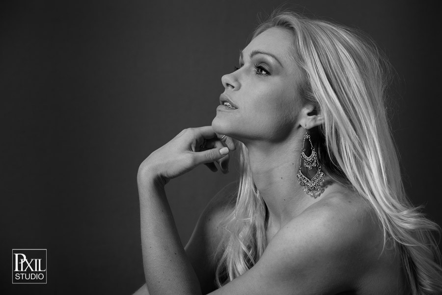
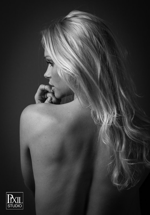
If you would like to see more from this set please visit Rachael headshot/model photography in Denver
Thank you for leaving a comment
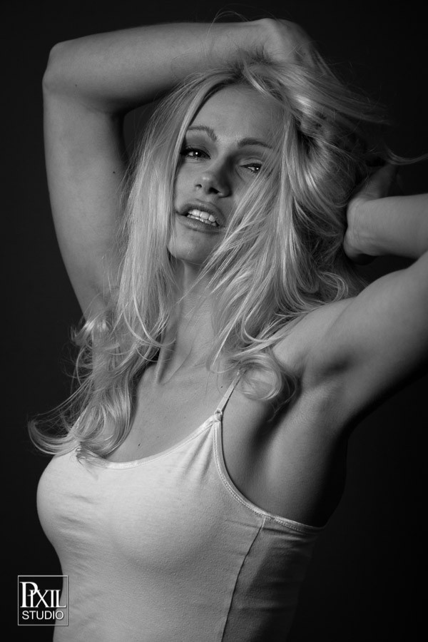
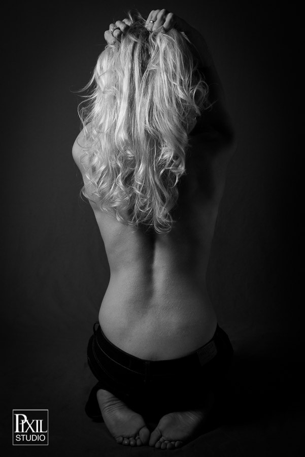
 
that face in #2. rofl. great shots.
 
Nice shots! I like 4 the best. The hair covering half her eye in 2 is a little annoying.
 
I stopped by your site. Very good set with her. She phgotographs very well. I liked the B&W profile here. Denver model headshot fitness photographer

There were loads of other good shots of her there; I'm not sure that the B&W shots shown here are really the best of the set, but they are all of course "work-safe".

thanks I am going to make other posts with the same model but figured it would be better to group them in themes. this was the first set and the B/W theme
 
I find these reading weirdly dim.

Don't get me wrong, they're very nice. You have done well and should be pleased!

The range of tones is certainly full, you've got lovely highlights in the hair, and there's a lot of darkness around. I like a lot of black in my pictures, so, I approve heartily.

But there's something a little off here, it "feels underexposed" which I *think* comes down to her skin tones being too dark for my taste. I messed around with some curves but I don't think that's it. I think a different b&w conversion would serve this well, to keep that sleek look you've got going on (not too contrasty, lots of lovely middle greys enjoying themselves) but with the skin tones pulled up a bit.

Well, that's what *I* would do, if these were my pictures.
 
I'm with Amolitor here - terrific set of images, wonderful model and poses. She is certainly lit adequately. But they do seem a bit on the dark side, maybe even a mite flat. Worth a re-visit, if you've a mind to. :)
 
For the most part, fantastic. I think the actual lighting on the set was fine. The dim/dullness seems more post processing related to me. But poses and expressions and cropping and focus are all great.

But yes, flat light, that can probably be solved mainly with levels/curves.

Also, the backgroudn is very posterized in these, suggesting you did most of your edits in 8-bit, and/or repeatedly re-saved in jpeg or similar. Maybe this was just in the final step to upload to the internet, but if not, you need to be careful not to do that. Get the lighting right in the camera + the raw converter, then try not to touch it in photoshop, UNLESS you import at 16 bit, then go ahead and monkey with it and you won't get much posterization.

I can't fix the posterizing without an original file, but here's my take on the dullness:
$girl.jpg


Well also, she looks like she wants to eat me in the second image... that's just the one though.
 
For the most part, fantastic. I think the actual lighting on the set was fine. The dim/dullness seems more post processing related to me. But poses and expressions and cropping and focus are all great.
But yes, flat light, that can probably be solved mainly with levels/curves.
Also, the backgroudn is very posterized in these, suggesting you did most of your edits in 8-bit, and/or repeatedly re-saved in jpeg or similar. Maybe this was just in the final step to upload to the internet, but if not, you need to be careful not to do that. Get the lighting right in the camera + the raw converter, then try not to touch it in photoshop, UNLESS you import at 16 bit, then go ahead and monkey with it and you won't get much posterization.
I can't fix the posterizing without an original file, but here's my take on the dullness:.
well...
thanks all for stopping by ill address the last first the poor image quality is due to the export. i just use lightrooms html gallery maker to export the images on to my site. the quality is not great but it loads super quick and keeps me from code-ing galleries ( i wrote my site myself)

as far as the dim pics...
i do agree that they are a little dim i think there are 3 reason.
first lightroom's default background is black, every time i post on a white background they seem dimmer relatively and they probably are
the other reasons i believe is that i edited them in a dark room with the lights out and after recalibrating my monitor i noticed i had the brightness on my 27imac all the way up rather than half way.
I do appreciate the comments and ill post another set with Rachael soon
 
I hope I'm not be too harsh. But, why are you giving 3 reasons why the lighting is dim in the shots you posted? If you knew that in the first place, why ask us to comment on the lighting? What's the point? Post correct pictures first. How else can we meaningfully critique on your work ?
 
Love 1,4 and 5. The others need some more retouching. You have some pretty dark shadows popping up, so you might need to even up your lighting some. Overall very good though. I want to play with all of them.
 
I hope I'm not be too harsh. But, why are you giving 3 reasons why the lighting is dim in the shots you posted? If you knew that in the first place, why ask us to comment on the lighting? What's the point? Post correct pictures first. How else can we meaningfully critique on your work ?
i didn't notice it right away and after people mentioned it i reevaluated the situation and admitted fault and investigated why. thanks for the contribution
 
Love 1,4 and 5. The others need some more retouching. You have some pretty dark shadows popping up, so you might need to even up your lighting some. Overall very good though. I want to play with all of them.
help yourself always fun to see what others do
 

Most reactions

New Topics

Back
Top