sarahashleyphotos
TPF Noob!
- Joined
- Feb 21, 2009
- Messages
- 197
- Reaction score
- 2
- Location
- VA
- Website
- www.myspace.com
- Can others edit my Photos
- Photos NOT OK to edit
www.sarahashleyphotos.com
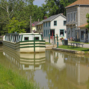
What do you all think? Suggestions are welcome.
What do you all think? Suggestions are welcome.
![[No title]](/data/xfmg/thumbnail/39/39183-f229dae0963376879140c9959e33f935.jpg?1619738903)


![[No title]](/data/xfmg/thumbnail/34/34116-b81991a4a8a532509a981cadbacd573c.jpg?1619736286)