Real Fog Shoot - Savannah w/ Butterfly MU

DGMPhotography

Been spending a lot of time on here!
Joined
Mar 23, 2012
Messages
3,160
Reaction score
718
Can others edit my Photos
Photos OK to edit
Hey folks,

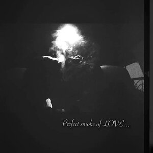
Here is an image (two different crops) from a recent shoot. It was a collaborative project to create a photo she can use for her album cover. Her concept was the butterfly thing, and she hired a MUA for the job. I got to use my new pop-up backdrop and fog machine. Quite an improvement over my last attempt at "fog." Also used were 3 Yongnuo flashes and gels.

Savannah Hatcher Shoot 2 - Daryll Morgan Studios-4 Cropped.jpg
Savannah Hatcher Shoot 2 - Daryll Morgan Studios-4.jpg

C&C is welcome and appreciated!
 
As an Amazon Associate we earn from qualifying purchases.
Decent lighting on her, I like the fog, I like the gels, but the butterfly doesn't look "all that" butterfly-like to me.
 
Decent lighting on her, I like the fog, I like the gels, but the butterfly doesn't look "all that" butterfly-like to me.

Yeah, I agree. It looks kinda cool still, but not screaming butterfly. the MUA she hired only does it on the side, but it's who she wanted to work with.
 
Any thoughts on the crop?
 
I like the lighting in the second, particularly where you've got a bit of magenta in the fog though I agree with Derrel, the squre crop is better framed.
 
I like the lighting in the second, particularly where you've got a bit of magenta in the fog though I agree with Derrel, the squre crop is better framed.

It's the same photo in each image, just cropped differently.
 
I like the lighting in the second, particularly where you've got a bit of magenta in the fog though I agree with Derrel, the squre crop is better framed.

It's the same photo in each image, just cropped differently.

Yeah mate, it's the magenta fog that's lost in the crop that I like. Admidedly I didn't phrase that well. oops.
 
Decent lighting on her, I like the fog, I like the gels, but the butterfly doesn't look "all that" butterfly-like to me.

Yeah, I agree. It looks kinda cool still, but not screaming butterfly. the MUA she hired only does it on the side, but it's who she wanted to work with.
If the makeup artist is on set, and you have the time, don't be afraid to speak up and say something like "I don't think this quite expresses the look we had in mind", and have the MUA consider redoing it or fixing it. In the end, you're responsible for the final image and as a professional you can't point fingers at anyone else. If you know that they'll be doing makeup or hair before-hand or off-set, it's worth it to show up and be present for some of that process. I've had MUA's do terrible makeup before and as a result I had to do a lot of extra retouching to fix it, and it would have saved me the trouble to just be there and ask the MUA to elevate the work being done.
 
For me it is a confusing image. It looks like the blue creature (butterfly?) is oozing out of her eye. Was that the idea?
 
I probably wouldn't have gotten "butterfly" without being told that that was the intent, but that's okay. You said it's for an album cover, maybe there are contextual clues in the album title or other artwork which may be added. And I don't know her music, maybe an abstract "butterfly" is more appropriate than an obvious, detailed one.

Regarding the shot itself, I think the fog is really well done. I do prefer the framing of the square crop (certainly more appropriate for an album cover, and within that constraint you did well), but I really miss the magenta that made it into the rectangular crop. With it in the background, the red lighting on her hair and face looks a bit forced and out of place.
 
I'm not opposed to using both images. I think they each have their strengths and weaknesses.

As for the makeup, that's not really my field of expertise, and I thought it still looked cool, so we went with it.
 

Most reactions

Back
Top