Really looking for input - first post here

eortmann

TPF Noob!
Joined
Aug 6, 2006
Messages
6
Reaction score
0
Location
Oregon
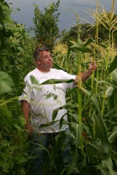
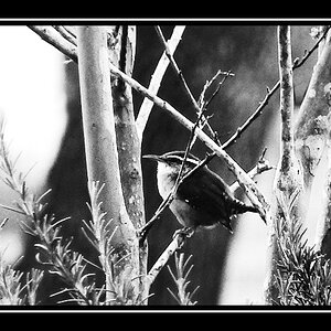
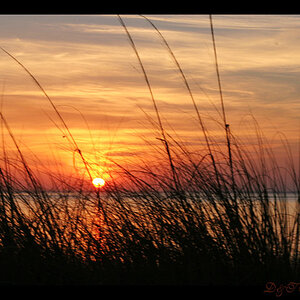
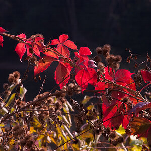
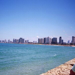
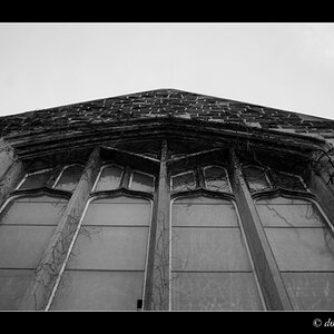
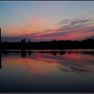
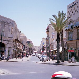
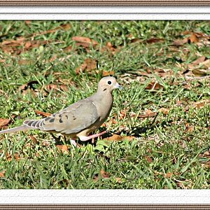
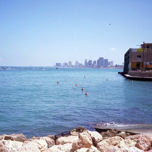
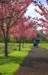
Thanks so much for looking! I am a mom with no technical training, a good camera and a love of photo images. Because I lack the education I am always second-guessing my photos. One of my favorite things to do every summer is enter in our little county fair. It has a nice photo comp with several catagories. I usually find my items entering in Life in Our County - People and Activities. I've done fairly well there but one problem with that is the pressure of having done well in the past. Every year I get so worried that this is the year I will totally skunk. Truly though, this year I just don't have anything and I need 3 images printed and matted by next Saturday. The two things that they look for it seems to me is sort of "slice of life" or tourism-friendly shots. Please let me know what photos (adding one tonight & more tomorrow) you like best with those thoughts in mind and also of course, critiques are always welcome since I have so much to learn. Don't worry, I have four kids so if I can't take honest critiques, I'd have been in trouble by now :)! Thank you all again for your time. I am really happy to have found this forum and excited to hear from you!!!
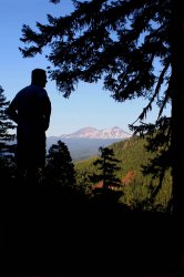
 

Attachments

  • $HorsePastDalesmall.jpg
    $HorsePastDalesmall.jpg
    271.5 KB · Views: 193
  • $MomTHugEdit3.jpg
    $MomTHugEdit3.jpg
    250.9 KB · Views: 179
  • $BoysWaterWash1edit.jpg
    $BoysWaterWash1edit.jpg
    137.4 KB · Views: 194
  • $RhettTreeWat1editsm.jpg
    $RhettTreeWat1editsm.jpg
    247.6 KB · Views: 173
I think that photo you have there is a very nice capture. :) Nice silhouetting with a pretty landscape in the background. I say you probably should crop some of the excessive black space off the bottom, though.

edit: I see you've posted more photos. The above was about the first photo ;-)
 
For a slice of life - certainly the boys under the water spray is perfect. The first two shots have great color. I love the apple blossoms. The fourth shot does not do much for me.
 
i think the three first are ok the fourth just looks very snap shotted.

good luck
 
On my monitor, all of them look a little soft.
#4 is my favorite. The composition works and so does the subject matter. It needs more contrast. A touch of PS processing and you will definately have yourself a winner.
 
I really appreciate all of your comments. I have been trying to figure out how to post images so they are in the message instead of thumbnailed. I do think they also look a little softened the way they display, but the originals are all pretty sharp.
The first one is the only one I have really been thinking of submitting. Would anyone have any other suggestions for improvement on it before I order my enlargement? Also, does the second one with the pink trees just seem to be missing something to you - or is that me? :wink: More THANKS!
 
1 and 2 look the strongest to me and I think I'd crop out some of the bottom blackness as well.

3 looks like it has potential but I feel like it's a bit busy. 4 is ok... not a bad a shot but of the 4 it's my least favorite because the other 3 invoke some type of feeling or response where 4 doesn't have much of an impact for me.

Best of luck though... post how you do.
 
i'm with rmh159 here, 1 & 2 are "wow" shots, while 3 & 4, just leave me with not much emotional impact.
 
eortmann, You have a PM in your inbox.
Cheers
 
I think #4 would have been a killer shot if you had gotten a little closer to the subject and he wasn't looking at the camera.
 
as with everyone else, i think #! could use some croping of the black bottom, #2 is good but i cant really figure out what is going on, if he was at the beginning or the middle of the road with his arms spread it would make sense, but hes at the end of the road, why is his arms spread? (rhetorical question).
#3 looks too busy for me
#4 the shot would be good if he was doing anything other then looking at the camera. skipping a rock, fishing, hanging from the tree, or even just looking at the water.
 
I like the framing in the first and the second I believe would be just awesome in black and white or desaturated slightly. I love the color and the vividness, but I feel it takes from the couple. I would try to make them the focal point. but i do like them as they are. great Job!!!
 
Thank all of you so much for your suggestions! Sorry, I have been gone for a couple of days! I am so excited to see your comments!! I agree about word for word with most all. I like 3 because of the story, but personally I choose things that area a little more "simple" as far as the subject goes. As for #4, I do like it better with more saturation, but I also have told my kids that we need to go back to the spot and shoot some more there during a different time of day - I did have some of him looking down, but I think they may have been not too sharp or something - I will look and see if I can find them...I do mostly "back of the head" stuff it seems...:lol:
About #1, I do feel most confident with it. I cleaned it up a bit and had it enlarged. It looks pretty good... Any ideas about it are still welcome though.
Lastly, I have a couple of others I am thinking of, one I got of my farming neighbor last night ( I like the crop better, but maybe it looses a sense of the location then??) and more of just a "people" shot at another barn near my house.... Still don't know how to place the images IN the text like you all do, but maybe thumbnails work ok...
Gratefully,
Erin
 

Attachments

  • $RayCorn1small.jpg
    $RayCorn1small.jpg
    223.7 KB · Views: 124
  • $AthenaBarn2small.jpg
    $AthenaBarn2small.jpg
    172.3 KB · Views: 120
  • $RayCorn1Crop.jpg
    $RayCorn1Crop.jpg
    207.4 KB · Views: 114
I love the girl in the barn(?) The framing is awsome. I don't even mind that she is truncated (maybe shoot it again as a vertical with her whole body?) This is an excellent candidate for B&W.
 

Most reactions

New Topics

Back
Top