Recent Photo shoot C+C

sparks017

TPF Noob!
Joined
Jan 24, 2012
Messages
55
Reaction score
1
Location
Auburn, WA
Website
www.christianjanderson.com
Can others edit my Photos
Photos NOT OK to edit
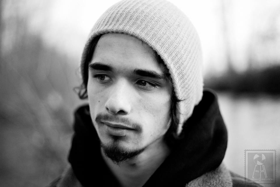
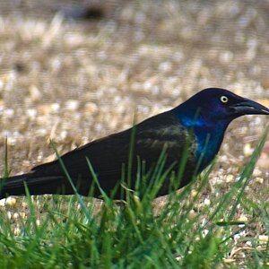
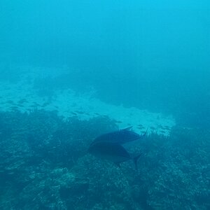
This is a sneak preview to a photo shoot I did with a friend to add to my portfolio. It was also a photo shoot for his sponsor on which I am somewhat of a photographer for them. Let me know what you think.

6807755447_e4b1c1f544_b.jpg

6807755435_9c48d2be6d_b.jpg

6807755401_302b6c0679_b.jpg
 
In #1, the bright light is very distracting.

I think 2 would have been nicer if you put him on the right side of the frame as opposed to the left, so that he was looking towards the left of the frame. It's a bit awkward to not see where he's looking.. If that makes sense. Same with #3. Also I think you should have included the top of his head in both 2 and 3.

Why the hat in all three? It seems like the facial hair would go along with his head of hair, but the hat is hiding that.

3 is my favorite if I had to pick one, but he is centered which also looks a little off.
 
His hair was really really messy and was almost impossible for him to tame it. For the mood I was going for the hair would have been almost a distraction than something that complemented the photo. That's why I had him wearing the hat.
 
His hair was really really messy and was almost impossible for him to tame it. For the mood I was going for the hair would have been almost a distraction than something that complemented the photo. That's why I had him wearing the hat.

I see. Fair enough, good call going with the hat in that case.
 
Maybe it's my eyes, but I can't see anything in #2 or #3 that is sharp. I'm a big fan of critical focus...SOMETHING needs to be tack sharp.

#1, agreed with cbrown222. The window/door is distracting. Crop it out, to maybe a square crop and I think you may have something. His eyelashes are nice and sharp with a very shallow DOF, which I like.

I don't mind #2's composition so much. Looking out of the frame can create mystery sometimes (if you go all the way with it) and with the train tracks creating leading lines, him off on a third, I think it works.

#3 however, I don't like the composition of. He's dead center, looking off to the left. Like I said, either put him to the right looking INTO the image, or go all the way with it and put him far left looking out. This one is just boring. I do like the small catchlight in his eye though.
 

Most reactions

New Topics

Back
Top