Recent shoot(did I over do the eyes...?)

Deadeye008

TPF Noob!
Joined
Apr 24, 2007
Messages
532
Reaction score
0
Location
Utah
Website
www.hamblinphoto.com
Can others edit my Photos
Photos NOT OK to edit
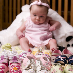
I did a shoot with a couple of little girls and their mom a few days ago. I did some eye "enhancement". Would like to know what you think, if I over did it or if it looks good. Other C&C welcome. :mrgreen:

1.
2057022308_a5178acdee_o.jpg


2.
2056237499_15130ce7ea_o.jpg


3.
2057022454_3b88c3e9fa_o.jpg


4.
2057022588_f7d8e8d853_o.jpg


5.
2057022812_9656c61da6_o.jpg


6.
2057022836_3e3a913fd3_o.jpg


7.
2057022970_f32691b7a9_o.jpg


For some reason when I upload pics through flickr it makes them look soft, oh well...
You can check out the rest of the set on my flickr page!
 
Now I see 'em!

#1 - it doesn't look like any enhancement was done on the eyes
#2, #3 - looks OK
#4 - the eyes are a little too much on this one. I think the whites of her eyes are just too white in comparison with everything else
#5 - OK, but mom's eyes are much sharper than the girls', which looks a little funny
#6 - older girl's eyes are too much (whites are too white again), younger girl is OK
#7 - almost too much, but OK
 
In #7, you can actually see some white pixelization at the corner of one of her eyes.

I agree with bella about mom's eyes. Her eyelashes are waaaaaaaay too sharp compared to the rest of the picture.

Did the older girl have scratches on her face?

Cute kids. :)
 
A rule I was once told and has served me well is, never make teeth whiter than the eyes and never make the eyes whiter than teeth.
When the eyes are that white the teeth look very yellow.
There are several things that need to be improved

Image 1: a tighter crop would serve you well in this one, the fountain in the background is a bit distracting and the eyes are out of focus.

Image 2: The very bright background rock draw the attention away from the two girls, this image would also be better cropped

Image 3: I see what you were trying to so with this image by using the sun as a hair light, but it is too strong and pulls you attention away.

Image 4: Needs to be cropped, without composition it is just a snapshot.

Image 5: Again needs to be cropped and try to get your flash off the camera, it will give your lighting more impact.

Image 6: This is a good one, you have foreground and framing, I would suggest crop just a bit more off the top

Image 7: The eyes seem pixelated like the other have mentioned.
Overall you may want to get your monitor calibrated as well as the skin tones are very red in some.

Just my 2 cents
 
i think the processing overall looks a little unnatural, but the composition and posing all look really good to me
 
Sorry everyone. There seems to be something wrong with my flickr account. I will get it fixed and repost them. Thanks to all who have commented!
 

Most reactions

Back
Top