Bossy
No longer a newbie, moving up!
- Joined
- Nov 15, 2011
- Messages
- 1,372
- Reaction score
- 252
- Can others edit my Photos
- Photos NOT OK to edit
Bossy, being a complete and utter newbie at all of this, I certainly can't comment on whether the editing you did is good or bad, but I'm curious if it would be possible to fix one thing in what you did. While I can definitely see that it appears straighter from one side to the other in your latter post comparing the two, when I first looked at your version of the picture I didn't notice that at all. What I did notice was that the phone booth on the right appeared very distorted and unreal because of the slant of the lines. I have to say that it gave me a kind of sea sick feeling and felt almost like a Salvador Dali painting (ok...maybe a bit of an overexaggeration). I love the other stuff you did to the picture, but is there a way to correct that, or is that just inevitable in the process of straightening the picture?
There's definitely a way to fix it, like its been pointed out, I did it pretty rough
 Hows this one-
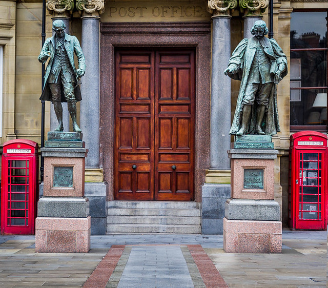


![[No title]](/data/xfmg/thumbnail/37/37642-b84a3ab0bc05ccd30092514e185e7c01.jpg?1619738160)


![[No title]](/data/xfmg/thumbnail/34/34349-9e6dfcf7d5163c413329b9b4a5872791.jpg?1619736385)