Robin in Front Yard

Quok1mb0

TPF Noob!
Joined
Aug 15, 2006
Messages
167
Reaction score
0
Location
Dallas Tx
Website
quok1mb0.deviantart.com
Can others edit my Photos
Photos OK to edit
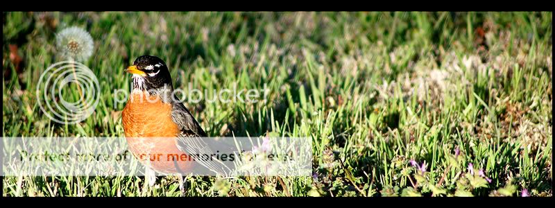
took these this afternoon of a Robin chilling in the front yard...what you think?

1.
Robin.jpg


2.
robin1.jpg


3.
robin3.jpg


Thank you for looking!
 
The bokeh is really distracting and they're all off balance. I'm not liking the wide crop.
 
there's something about #2 that i really like...can't explain it technically...but i like it :)
 
I, on the other hand, like the bokeh. It draws my eye right to the feather detail.
 
Well, I like the bokeh, too, the well placed focus and the narrow crops. But only Photo 2 places the bird well with lots of room for it to look into, which it does! Good.
In the other two it seems to be about to walk out of your frame.
So Photo 2 it is!
(And you call a completely different bird a robin than we Europeans do, ours are much smaller and rounder and have this very red "bib" on their chest).
 
I think they are all great, I love the wide crop.

And the 2 that look like they are walking out of the shot tell a story to me.
In my experiences of taking wildlife shots most of the time the animal or bird is trying to get out of the picture:er: (ie camera shy :) ) and these shots show that very well.
Why do things have to always look into a picture to tell a story????

Its good to see a comp different to the same old portraits
 
I can agree with that, Hoppy.
So let me put it like this:
Photo 2 follows the "general rules" best.
Light, focus, DOF and bird are all good in all three of these pics.
 
I can agree with that, Hoppy.
So let me put it like this:
Photo 2 follows the "general rules" best.
Light, focus, DOF and bird are all good in all three of these pics.

I wasn't meaning to get at anyone in particular :blushing:.... maybe I could have worded it a bit better......

:hug:: :hug:: :hug::
 
i like the wide crop too, it's different. i agree with lafoto on #2 being the best composition of the 3, but I also like the profile view of #3, facing away from the majority of the composition... very interesting... :thumbup:
 

Most reactions

Back
Top