Rockstar

zoe08

TPF Noob!
Joined
Sep 19, 2005
Messages
70
Reaction score
0
Location
TX
Website
www.photoartclub.net
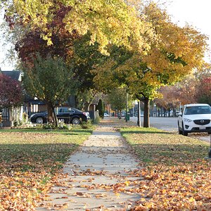
Here are a couple of pics from today, I have a lot more I will probably post some more later...

I think I might have underexposed some .... please let me know what I can do to improve...

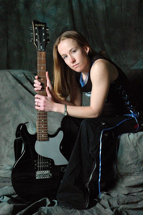
This assignment was using 1, 2, and 3, light set-ups ...these are all 1 lights...

rockstar.jpg


rockstar2.jpg


rockstar3.jpg
 
What were your settings in these (fstop, shutter speed, light settings, etc...)? The third one is the better of the three but is missing on a little "pop".
 
I like the third one. I agree with the "pop" though. I'd boost the contrast a little with levels/curves (the histogram shows a flat right side), boost saturation by +25, and add about +8 red to warm things up a touch. The guitar still ends up a little dull, but I think she's the focus here. I can post that edit if you like.
 
that would be great! Thanks!! Most of these I am just kind of bracketing some but I have not figured out how to use the handheld light meter right, everytime I go with what it says, it overexposes the pic.

And I know the lighting isnt right but say if the lighting was right, would you like them? I am trying to be more creative in the posing and stuff...
 
I like the 3rd best, but it still feels a bit awkward to me. A guitar in the hands of someone that knows how to play looks like an extension of their body. I don't get that feel from the picture, it's a bit far removed from the person and feels a bit stiff. Kind of like, "here look, it's a guitar." Rather than, "I am a guitar player." Make any kind of sense?
 
as far as the posing goes, i remember some of your earlier posts, and these ones here are much more creatively done. So i would see you are making progress
 
I think the lighting and exposure is fine, especially considering you are using only one light. Most images need some sort of adjustment. Consider the original digital file a negative. You could print it just straight, but if you spend the time to get the right paper and filters you get a better print. Same with a little digital editing. I also did a little sharpening appropriate for this size image.

rockstar3-mod.jpg


I agree with John. I think your eye is developing. Nice job! :thumbsup:
 
BTW, I think the post is a good one. I like how the lines of her pose work with the guitar. It all feels balanced to me as my eyes work their way around the image. The only drawback might be the close crop on the right, but it also may be helping to keep my eye in the image.
 
I like the edited image alot.

As for your settings, I'd turn the flashes down and go for an f5.6 1/250 and adjust your light to match. The background is getting too much light and is too well in focus for my taste and, IMO, takes away from the "feel" of the image. I think it makes your subject too much a part of the background instead of making her stand out. I agree with mark about the posing being really good also. You're doing awesome! Keep at it and let us see what you get.
 
Thanks for the edit that looks much better!!

I have a problem knocking the light down so that i can get my settings that low, that was done with a softbox about as far away as i could get the cord to go and it was on 125 watts...

i really wish i had a photographer in the area that i knew that had experience with lights and everything that could help me out...

I am actually looking right now into buying some of my own lights and equip...Im trying to find which kind of lights would be best for the cheapest price...
 

Most reactions

Back
Top