Hello ,,and welcome,
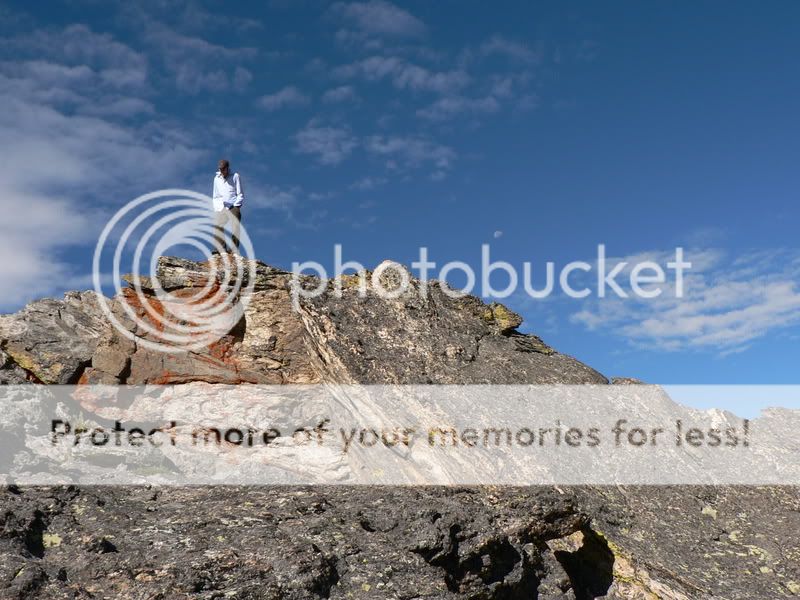
I find the red streak in #1 draws you to the fella,nice touch.
IMHO would look better as a portrait,
#2 I like the pathway leading you in, I find my eye stops at the lake,
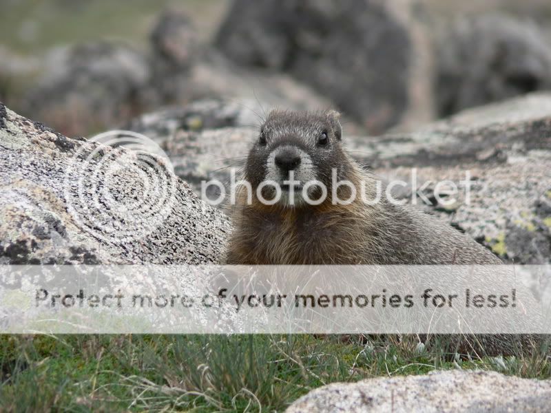
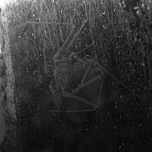
The marmot is brilliant! very sharp,and nice bokeh.
Nice sky in #4 I find the trees draw me to the centre,witch is rather plain.
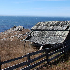
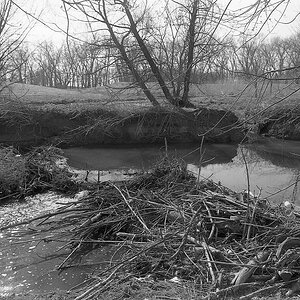
#5,,the pebbles draw me in 2 the centre,and I cant seem to find an apealing way out,maybe crop some sky out.
There,s some interesting light going on ,,nice dof,
Nice images ,would like to see them after you edit.
The first is really nice with the red rocks leading to the person and the hint of a moon in the sky behind him. That little moon sure adds to the pic as much as the red rocks do, oh yes!
In all the middle pics I am not happy about the place of your horizon line.
With some cropping you can shift it and will find the photos look more interesting instantly. I can see why you didn't lower your camera any further than you did for the second photo showing here, for you did not want to include that sign (of which we still see a little), but maybe it would have served composition more if you had either included it and cloned it out later, or found yourself another spot that would have excluded it to then include some more foreground and path that would lead our eyes ... and the line of puffy white clouds would have done for a sky, all the upper rest with only blue and a bit of cirrus does not really add to the picture.
The marmot is VERY cute!!!
Then come two pics with a centred horizon again.
I like #5 quite a bit, taken from right inside the creek including the pebbles as foreground, I really like that and it has potential, but there is too much sky in there, too.
The last is good. Colourwise and all. Sunsets will always fascinate the viewers.
1 is well balanced compositionwise. 2 has abit too much sky. The marmot is great, sharp enough to see whiskers and clear eyed. 5 has some interesting red rocks though I would move a few feet closer to get rid of some empty space at the bottom. Nice series.
nice series, i pretty much agree with what has already been said... love that marmot, and i think #5 is my favorite. looks like a beautiful place. :thumbup:


")
![[No title]](/data/xfmg/thumbnail/34/34078-48bd13f44e7bb42fdcc0154c5ee7c78e.jpg?1619736268)
![[No title]](/data/xfmg/thumbnail/37/37631-1af996afcca522b3c5490538125d9599.jpg?1619738155)


![[No title]](/data/xfmg/thumbnail/37/37630-10bda987ab220dc60e7c1cb65502f83c.jpg?1619738155)