Bitter Jeweler
Been spending a lot of time on here!
- Joined
- Apr 27, 2009
- Messages
- 12,983
- Reaction score
- 4,991
- Location
- Cleveland, Ohio
- Can others edit my Photos
- Photos OK to edit
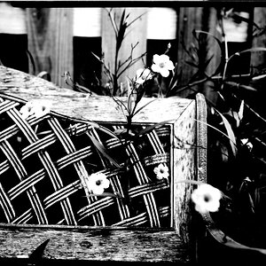
For this weeks Group 1 C&C, we were asked to focus ") lmao on the Rule of Thirds. Here is what I composed:
lmao on the Rule of Thirds. Here is what I composed:
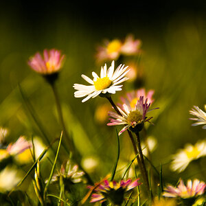
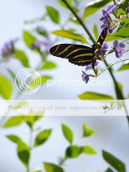
Shutter: 1/13
Aperture: F5.6
Metering: Evaluative
Exposure Comp:-1
ISO: 100
Lens: 55-250mm f/4-5.6 IS
1).
The focus here is on the body and wing, which falls at the cross point of the lower, and right division. I am quite pleased with the color composition (on all three pics here).
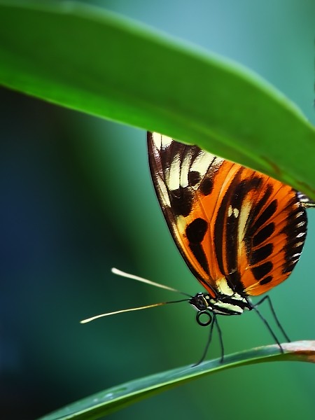
Shutter: 1/1250
Aperture: F5.6
Metering: Evaluative
Exposure Comp:-1
ISO: 100
Lens: 55-250mm f/4-5.6 IS
2).
At first I was going for a horizontal crop, but I just didn't like the empty space that would have been in the center. I felt it would just let you leave the picture. The little bits of leaves at the bottom should be enough to help lead your eyes around. The focus is in the "golden section" or the upper right corner, at the intersection of the top and right division into thirds. I am very, very happy with this image.
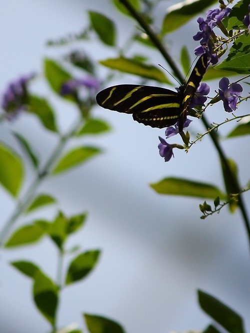
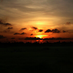
Shutter: 1/3200
Aperture: F1.8
Metering: Evaluative
Exposure Comp:-1
ISO: 100
Lens: 50mm
3).
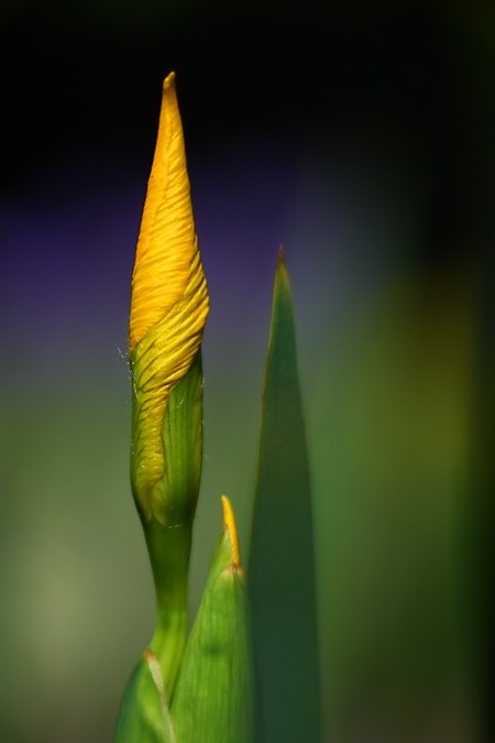
Now I know "sharp as a tac". I was really looking at the background when thinking about how to frame up these Iris buds. I searched over several mound of Irises, for the best subject, and saw the purple Salvia in the background and knew where I had to frame it. It really makes that bud pop! Following the rule of thirds, I have the focus near the upper left intersection. The purple also carries you across the upper division. To me that little bit of curving blacknes is just enough to bring you down to follow the yellow green in the back, and you come down and catch the central leaf.
So, what do you think? What do you see that I don't? C'mon, be super critical. You will only make me grow stronger!
Thanks for your time,
David
lmao on the Rule of Thirds. Here is what I composed:Shutter: 1/13
Aperture: F5.6
Metering: Evaluative
Exposure Comp:-1
ISO: 100
Lens: 55-250mm f/4-5.6 IS
1).
The focus here is on the body and wing, which falls at the cross point of the lower, and right division. I am quite pleased with the color composition (on all three pics here).
Shutter: 1/1250
Aperture: F5.6
Metering: Evaluative
Exposure Comp:-1
ISO: 100
Lens: 55-250mm f/4-5.6 IS
2).
At first I was going for a horizontal crop, but I just didn't like the empty space that would have been in the center. I felt it would just let you leave the picture. The little bits of leaves at the bottom should be enough to help lead your eyes around. The focus is in the "golden section" or the upper right corner, at the intersection of the top and right division into thirds. I am very, very happy with this image.
Shutter: 1/3200
Aperture: F1.8
Metering: Evaluative
Exposure Comp:-1
ISO: 100
Lens: 50mm
3).
Now I know "sharp as a tac".
I was really looking at the background when thinking about how to frame up these Iris buds. I searched over several mound of Irises, for the best subject, and saw the purple Salvia in the background and knew where I had to frame it. It really makes that bud pop! Following the rule of thirds, I have the focus near the upper left intersection. The purple also carries you across the upper division. To me that little bit of curving blacknes is just enough to bring you down to follow the yellow green in the back, and you come down and catch the central leaf. So, what do you think? What do you see that I don't? C'mon, be super critical. You will only make me grow stronger!
Thanks for your time,
David

![[No title]](/data/xfmg/thumbnail/36/36399-041c9ebc3a39e89ec8e39243c0d43528.jpg?1619737551)
![[No title]](/data/xfmg/thumbnail/37/37603-739c5d9b541a083a12f2f30e45ca2b7b.jpg?1619738147)
![[No title]](/data/xfmg/thumbnail/37/37604-7ad625e983f92f880eb65a264eeef5e4.jpg?1619738148)


![[No title]](/data/xfmg/thumbnail/31/31012-f5e0c7cdea2f2c3e44737e3f61c2461a.jpg?1619734567)