S & C engaged

willis_927

No longer a newbie, moving up!
Joined
Dec 19, 2010
Messages
624
Reaction score
82
Location
Winnipeg
Can others edit my Photos
Photos OK to edit
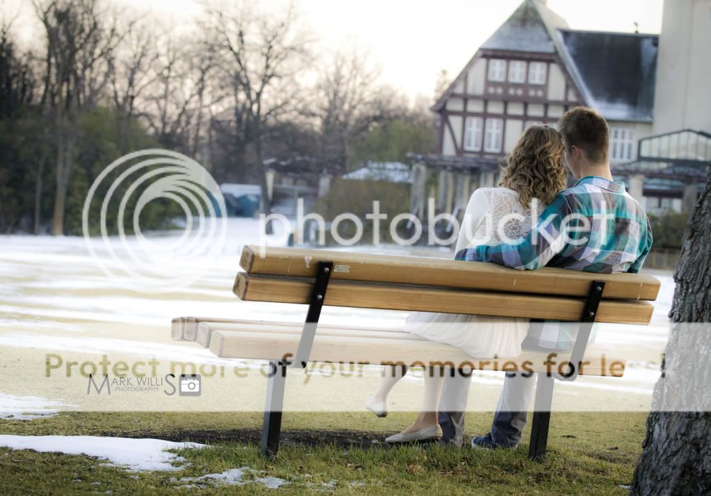
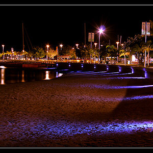
This is from a couple months ago.. but I havn't posted in a while so I thought I would throw some up on here. C&C welcome! (I know there is alot here for good C&C)

1.
IMG_3245.jpg


2.
IMG_34323.jpg


3.
IMG_34273.jpg


4.
IMG_34243.jpg


5.
IMG_3480.jpg


6.
IMG_3475.jpg


7.
IMG_3446.jpg


8.
IMG_3435.jpg


9.
IMG_3407.jpg


10.
IMG_3405.jpg


11.
IMG_3393.jpg


12.
IMG_3389.jpg


13.
IMG_3359.jpg


14.
IMG_3313.jpg


15.
IMG_3301.jpg


16.
IMG_3296.jpg


17.
IMG_3272.jpg
 
Hey Mark. Thanks for sharing these. My overall CC is you shouldnt overuse tilt. I think you can do a lot better with better processing and pick something more consistent. I think you should process them all the same. Maybe throw some B&W here and there. I see about 4-5 different processing on this set.
 
All good points, thanks Schwetty.
 
There are too many to CC seperately, so I'll just comment on the whole.

I think that there is too many tilted shots. This is a cool angle when used occasionally, but it seems that every other shot is uneven. In some of the photos (5, 6, 9, 17)where you used flash, the couple is fairly blue. Their skin tones don't seem to be correct
 
I agree with the tilt, #2 or #3 would be so much nicer without tilt. These aren't bad photos, but nothing in these set that scream wow. Just my opinion.
 
Skin and overall tone is a bit cool for my liking. Engagement is a warm feeling I think these would be nicer warmer. I abhor tilt in almost 99% of all images so I cant really comment other than that. Keep sharing.
 
IMG_3427.jpg

IMG_3427-2.jpg

IMG_3427-3.jpg


Here you go Mark. Dont go overboard with your edit. Simple = timeless.
 
IMO, you should pull down contrast a bit in number one, she looks a bit like an alien with that shadow on her face.
 
Looks like the swells were pretty big when you were shooting these pics! It's hard to keep 'er steady when the waves are hitting the boat so fast and furious and the skipper keeps backing off the throttle to hang back in the trough for a while,estimating the break timing, and then he powers her forward,up, andover each swell with blasts on the throttle...oh, wait...this isn't my saltwater fishing and photography forum... Just having a little fun with ya...and saying that the tilt is too consistently tilty!!! (ONE GUY'S OPINION)

I think a young couple will like these. I've been seeing more and more and more engagement pics done in naturalistic, wooded settings, with LOTS OF BRUSH AND LIMBS as background, paired with that awful faded 1970's Ektachrome slide film look...today's young people seem to like that look. Schwetty's trio of as-shown, natural color, and monochrome conversion is illuminating. This "vintage" look will look horribly dated in a few years...but then,so will his hairstyle and her clothes too...

This is kind of like what I have been seeing among my brother'd daughter's friends, in their early 20's...this is the kind of stuff that's out there. I think this set has six or seven really GOOD images in it! Ones they will look back upon with fondness.
 
I like the feel of these photos, very playful. Besides the fact that they are a bit cool, I think they look nice.

I hope you don't mind that I attempted an edit on one of your photos. I just warmed it up some and hope I didn't get too carried away.


Nothing to do with the actual photos but their wardrobes don't match (call me metro- for noticing ...haha). Either she's overdressed or he's under...
Also not digging the tilt. It's a nice set though. I would be satisfied with the quality if they were my engagement photos.
 
Agree with the tilting comments; I think it works well in 4 and 11, maybe even 16. Most of the time (same thing goes with PP), simple and clean is the best way to go.
 
Nothing to do with the actual photos but their wardrobes don't match (call me metro- for noticing ...haha). Either she's overdressed or he's under...
Also not digging the tilt. It's a nice set though. I would be satisfied with the quality if they were my engagement photos.

Hopefully, by their first anniversary, she'll be dressing him. That untucked, plaid flannel shirt look with her dressed in a summer dress,worn in the winter is, uh...really quite odd, on the part of both parties...I mean there's snow on the ground...and she's dressed like she's going to a croquet party or an Easter Egg hunt...while he looks primed for a trip to Home Depot.
 
Nothing much to add about the photos themselves--I agree with other posts regarding too much use of tilt, and the skin tones are just off a little.

But, I also find your watermark placement really distracting in some of these. I know you gotta put it where it can't just be cropped out, but I find myself focused on the watermark instead of the photo subject in many of them.
 

Most reactions

New Topics

Back
Top