S S S ( critique, suggestions solicited please )

Jasii

No longer a newbie, moving up!
Joined
Jun 17, 2015
Messages
470
Reaction score
171
Location
Dharamsala, Himachal Pradesh, India.
Can others edit my Photos
Photos OK to edit
Short, Simple, Sweet are the words that come to mind as I trudged through the undergrowth to reach this little brook hidden from the world.The light filtering through the tree cover, the dark shadows contrasting with the white of the water looked quite appealing as I made this shot. Tell me how I fared and was it wise not to have bumped up the mid-tones? Incidentally this happens to be my third pic that I edited under LR, would be extremely nice to know what I could have done better?

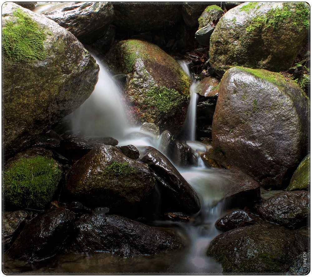
A small splash-0487 iii by jasiiboss, on Flickr
 
The composition and lightning are great. Personally I would have increased the shadows just a lil bit for the lower part of tbe photograph. Also I would have used a bit faster shutter speed so as to show some motion but also a little bit of texture in the water itself. The lower part of the photo bothers me a little about the water.

A side comment would be that maybe you should stop using borders and round corners? It's a distraction and also acts as a turn off.

P.s: on the first look photo looks great, it's just that when you get too involved you start noticing some things.
 
Agree the 2 hot spots at the bottom are an eyesore indeed.
Thank you for pitching in with your thoughts Sarmad. Appreciate it.
Rgds,
 
Nothing wrong with this image in my view.
You are way too kind here, Thank you.
1)The two hot spots at the bottom are kinda disconcerting. :) I did try to correct them in post but with my limited skill-sets was not able to do it.
2)Am somewhat glad that you asked me not to bump up the shadow areas, cos I somewhat like them the way they are.
Jasii
 
I like the shadow areas at the lower portion of the photo. It's that darkest area top-center that I think could use a bit more detail. There seems to be 2 spots, one on top of the other, near the bottom of the picture that looks like you tried to burn or lower the exposure. It looks a bit off. I might have used a brush with about 50% flow to run some streaks of +exposure through the lightest portions of the falls. They seem to be just a little under exposed. The streaks might help add to the leading lines, guiding the viewers eyes.

It is a very nice photo. I like that you concentrated on just a small area of the water. I agree with @Sarmad about the rounded corners though. The borders are a distraction. But they aren't so bad that I can't see you did a fine job capturing this scene.

Jim
Thanks Jim! You just made my day. That trick of running the brush at 50% flow is actually Yum. :)
Agree about the borders, they are going away and am looking hard at that middle top portion too.
Thank you once again.
Cheers,
Jasii
 

Most reactions

New Topics

Back
Top