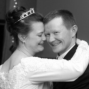
Sarah Elizabeth

Granddad

Been spending a lot of time on here!
Joined
Jun 22, 2011
Messages
2,271
Reaction score
1,333
Location
Lincoln, England
Can others edit my Photos
Photos OK to edit
Sarah is a rising star in the UK belly dance world and a fantastic model. She exudes vitality and confidence. So far I've just worked on the backgrounds.

1
$Sarah-5909c.jpg

2
$Sarah-5962c.jpg

3
$Sarah-6149c.jpg

4
$Sarah-6235c.jpg

5
$Sarah-6411c.jpg

As always I would appreciate and value your comments and suggestions for improvement. Bear in mind that these are studio action shots, not posed portraits. I strongly believe that the only way to capture the spirit of a dancer is to shoot her while she's actually dancing.
 
Nice! #2 I think is my favorite. My only notes are that I am sure she must have been working up a sweat.. she's kind of shiny in a lot of them, especially #3.. maybe try to tone down the shine on her. And then something is strange with the shadow beneath her in the first.. otherwise I really liked that one as well!
 
You're getting pretty good with the belly dancing stuff. I liked #1's pose and expression immensely. However, she appears to be placed too low in the frame, with too much top space and not enough foot space, but that's easy to re-configure in that background/shadow scenario. #2 is nice, very simple, solid shot. #3 she feels like she's riding a bit low in the frame area...kind of too much "lift" to the white space above her, but I don;t see any way to easily correct this in post unless there was more of her torso in the original. #4, her with the scimitar or whatever...holy mother of all that is holy, that's smokin' hot... and #5, I dunno, seems cramped at the top of the frame and in comparison to #4 I don't even see the picture, it just sort of fades into the background (probably from blood loss).
 
Nice! #2 I think is my favorite. My only notes are that I am sure she must have been working up a sweat.. she's kind of shiny in a lot of them, especially #3.. maybe try to tone down the shine on her. And then something is strange with the shadow beneath her in the first.. otherwise I really liked that one as well!

Thanks for the note on the shine, as I said I've only worked on the backgrounds so far so I'll take a look at that when I do the full monty (assuming these are included in the client's selections).

Derrel
You're getting pretty good with the belly dancing stuff. I liked #1's pose and expression immensely. However, she appears to be placed too low in the frame, with too much top space and not enough foot space, but that's easy to re-configure in that background/shadow scenario. #2 is nice, very simple, solid shot. #3 she feels like she's riding a bit low in the frame area...kind of too much "lift" to the white space above her, but I don;t see any way to easily correct this in post unless there was more of her torso in the original. #4, her with the scimitar or whatever...holy mother of all that is holy, that's smokin' hot... and #5, I dunno, seems cramped at the top of the frame and in comparison to #4 I don't even see the picture, it just sort of fades into the background (probably from blood loss).​


Thanks for those framing suggestions, Derrel; I see what you are suggesting and I think you're right. I do have spare space on all the originals to fix that. In my first selections I tend to go for standard 6x4 or 1x1 crops but that doesn't always work out. :thumbup:
 
Ah, I didn't read. lol
 
frommrstomommy Re the shadows, I took note of your comment on that and have found a different method of turning the background from grey to white that doesn't mess with the shadows so much. This was part of the shoot where one of my strobes ascended to the great strobe heaven in a cloud of electrical smoke (hence no background flash). I guess my subjects were too hot for it to handle. ;)
 

Most reactions

Back
Top