ItsssRyne
TPF Noob!
- Joined
- Mar 22, 2012
- Messages
- 50
- Reaction score
- 3
- Location
- New Orleans
- Can others edit my Photos
- Photos OK to edit
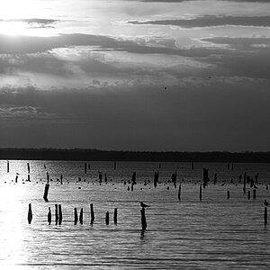
Alright this is an editing question. It's quite simple; how much is too much when it comes to Saturation and Contrast. I've noticed when editing my photos that I like the saturated more colorful look with dark contrast. Is this frowned upon in the photography community? I personally like the deep colors. I think the more color the better. Or should I find somewhere in between? The same goes for contrast, I like bumping up the contrast a lot; and I find my pictures come out better when I do so.
I've been using iPhoto for the time being until I can get my hands on photoshop.
Just hoping to get some advice and have someone point me in the right direction.
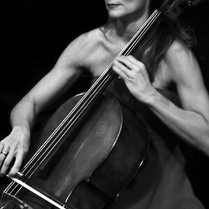
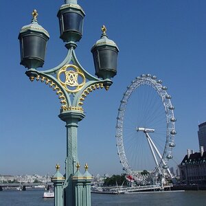
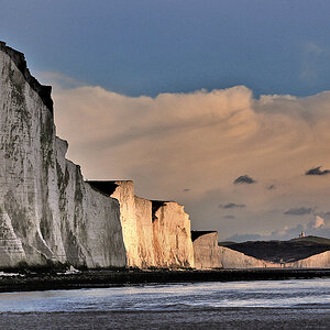
These are some old photo's from my first month of photography:
1.

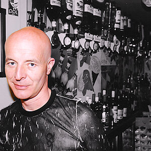
2.

What do you think? Am I in the right ball park? Or did I take a wrong turn at albuquerque?
I've been using iPhoto for the time being until I can get my hands on photoshop.
Just hoping to get some advice and have someone point me in the right direction.
These are some old photo's from my first month of photography:
1.
2.
What do you think? Am I in the right ball park? Or did I take a wrong turn at albuquerque?
![[No title]](/data/xfmg/thumbnail/30/30867-a58aa3d7c15d0b48498a201af3a68a8f.jpg?1619734485)