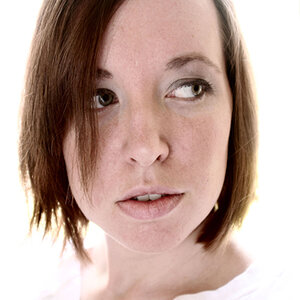
I like the first one. The second one kind of looks like a MySpace/FB picture. I don't like the composition - I feel that if you have some arm and torso in the shot - you should have it all in - meaning both your arms. The full arm. Just my opinion though!
I actually like the idea of the first one, but I don't like how your head is just barely hovering in the lower right hand corner.
If I were you, I would have pulled the frame back a little, composed my face closer to the left side of the frame and up a little in the frame to include some shoulder.
I like the first more, but I agree with E.Rose. As first attempt, I would let the neck be at least slightly visible. It is vaguely religious - something far from me, but communicative.
I somewhat like also the second (a sort of old paint), from the composition point of view, but I would give more light on eyes.
You are lucky that your model is always available to redo .
Thanks for the input people! I do agree that I should have had m neck in there a little more! Its kinda hard for me to get these I'm still not good with sp so I'm trying to get a little better.
I really like the first one, I just love B&W portraits. It would be nice to see how it would turn our if you pulled back a bit to included some neck and arm. I bet it would add to the composition in a really great way.

")
![[No title]](/data/xfmg/thumbnail/41/41937-bd46d08f9adcefe8bc65477f19a4f580.jpg?1619739947)