Navigation
Install the app
How to install the app on iOS
Follow along with the video below to see how to install our site as a web app on your home screen.

Note: This feature currently requires accessing the site using the built-in Safari browser.
More options
You are using an out of date browser. It may not display this or other websites correctly.
You should upgrade or use an alternative browser.
You should upgrade or use an alternative browser.
Semi-portrait.
- Thread starter mcblum
- Start date
Christie Photo
No longer a newbie, moving up!
- Joined
- Jan 7, 2005
- Messages
- 7,199
- Reaction score
- 148
- Location
- Kankakee, IL
- Website
- www.christiephoto.com
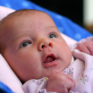
OK... I'll give it a go. First impression: overexposed. I feel you're really close with your lighting, but a few adjustments will push this one over the top. I would like to see how this one would look with your main light just a bit higher and a little further around to the back so that the cheek in the foreground is partially in shadow.
Posing: Not bad! The diagonal line you created from the upper left corner to the lower right corner is great. I want to tip her head down just a bit so I see less of her nostrils. And, the foot is a distration in this one.
What I feel would have helped the most is to key the background with the clothing. If this was on a deep background, or if she was dressed in white shirt, your eye would more easily go to the flesh tones.
All-in-all, not far off from amazing. I truley hope you find this helpful. Seems portraits are a bit tough to critique, especially when they're "mostly good" like this one. I look forward to you next post!
-Pete Christie
NikonChick
TPF Noob!
Personally, I like the over exposure, Although I agree about lowering the head very slightly and raising the light.
Nice job over all.
Nice job over all.




![[No title]](/data/xfmg/thumbnail/37/37621-b86590cf53fc4001d12701ee3091029b.jpg?1619738152)
