Navigation
Install the app
How to install the app on iOS
Follow along with the video below to see how to install our site as a web app on your home screen.

Note: This feature currently requires accessing the site using the built-in Safari browser.
More options
You are using an out of date browser. It may not display this or other websites correctly.
You should upgrade or use an alternative browser.
You should upgrade or use an alternative browser.
Senior Photos: Katherine
- Thread starter Trenton
- Start date
shed301
TPF Noob!
- Joined
- Aug 29, 2008
- Messages
- 123
- Reaction score
- 0
- Can others edit my Photos
- Photos NOT OK to edit
numbers 5 and 10 do it for me because they look natural, all the others look like they have a *forced* smile and it seems the model isn't enjoying herself a lot. with 3 and 7 you should have framed it up with that white door as a sole background and it would have emlinated that rubbish behind her. that way it would have drawn the viewer into the model more instead of looking around at her background etc. other than those couple of thingsw that come to my mind at the moment they arn't to bad at all..... keep it up.
GeorgeUK
TPF Noob!
- Joined
- Dec 26, 2007
- Messages
- 454
- Reaction score
- 0
- Location
- London
- Website
- www.pbmwforum.com
- Can others edit my Photos
- Photos OK to edit
#5 for me, nicest framing and pretty sharp 
dEARlEADER
TPF Noob!
- Joined
- Apr 9, 2008
- Messages
- 1,312
- Reaction score
- 1
- Location
- Canada
- Can others edit my Photos
- Photos OK to edit
Most of these suffers from harsh lighting issues. The use of a reflector and fill flash would take some of these to the next level. The posing on some are pretty good. I like how you use the lines from walls and fences to lead to subject. The background in all of these shots are in clear focus. This is good on some shots where the background contributes to the image, and bad on others where the background is a distraction.
quickly... some other really noticable things -
image one - there is a too much extra room above the subject and her hands are chopped off
image two - the power meters are too distracting and her hands are chopped off
image five - debris on the ground makes her shoe look really long and deformed
image seven - flare can sometimes be a cool effect, but not when a flare spot highlights her groin
as you develop you will learn to see these things on set up resulting in less complicated post processing..
good luck!
phoenix_rising
TPF Noob!
- Joined
- Mar 14, 2008
- Messages
- 102
- Reaction score
- 0
- Location
- Detroit, Michigan
- Can others edit my Photos
- Photos OK to edit
1-2 Look harsh. The model is smiling to gruffly. 7-8 the model looks lost and afraid. The backgrounds are a little distracting but workable. I would suggest doing some cropping work. I think some of the shots are a little too wide and the model just disappears into the background.
- Joined
- Dec 16, 2003
- Messages
- 33,896
- Reaction score
- 1,853
- Location
- Edmonton
- Website
- www.mikehodson.ca
- Can others edit my Photos
- Photos NOT OK to edit
Overall, there are some good things going on here. My one comment will be to crop tighter...just about every shot has too much surroundings and not enough subject.
ANDS!
No longer a newbie, moving up!
- Joined
- Nov 14, 2006
- Messages
- 2,178
- Reaction score
- 3
- Location
- Downtown
- Can others edit my Photos
- Photos OK to edit
#2 - I dunno. Keep thinking about SMUD. Power meters I guess are cool, but not in this situation.
I would crop out the sky in #4.
#6 is a cool portrait.
*7 - didn't work. A dead on shot, with a ton of clutter and light spots. A no go for me there.
I both like and dislike #8. I dont know why.
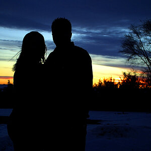
*9 is cool, but I would crop out the right side, and bring it tighter on the two. I wanna smack the dude, but his pose still works.
#10 is cool.
Last one, not a fan.
Where did that dude come from? Just random passerby? Also, how about a tripod (or two). Free up your hands, remote control the camera so you can hold your own reflector.I wanted to use a reflector but no one to hold one for me
Early
TPF Noob!
- Joined
- Feb 8, 2008
- Messages
- 1,239
- Reaction score
- 0
- Location
- Western NJ
- Can others edit my Photos
- Photos NOT OK to edit
I like these the best as far as human subjects go. Very relaxed poses. However, I enjoyed the old architecture in all the pics.I like them


Trenton
TPF Noob!
- Joined
- Aug 11, 2008
- Messages
- 22
- Reaction score
- 0
- Can others edit my Photos
- Photos OK to edit
#2 - I dunno. Keep thinking about SMUD. Power meters I guess are cool, but not in this situation.
I would crop out the sky in #4.
#6 is a cool portrait.
*7 - didn't work. A dead on shot, with a ton of clutter and light spots. A no go for me there.
I both like and dislike #8. I dont know why.
*9 is cool, but I would crop out the right side, and bring it tighter on the two. I wanna smack the dude, but his pose still works.
#10 is cool.
Last one, not a fan.
Where did that dude come from? Just random passerby? Also, how about a tripod (or two). Free up your hands, remote control the camera so you can hold your own reflector.
Thanks for the comments, and whats wrong with the pose? That dude is me... i guess i could buy a remote....
Thanks Early....
Most reactions
-
 449
449 -
 290
290 -
 271
271 -
 268
268 -
 214
214 -
 189
189 -
 180
180 -
 179
179 -
 175
175 -
 172
172 -
 162
162 -
 125
125 -
 117
117 -
I
106
-
 94
94



![[No title]](/data/xfmg/thumbnail/42/42461-e2a94a39b9483a804af86010fc52244b.jpg?1619740192)
![[No title]](/data/xfmg/thumbnail/42/42463-03457f0869c7510e6fb947b21de31aba.jpg?1619740192)
