Senior pictures for C&C....thanks

In His Image

TPF Noob!
Joined
May 11, 2009
Messages
42
Reaction score
0
Location
Southwest Ohio
Can others edit my Photos
Photos OK to edit
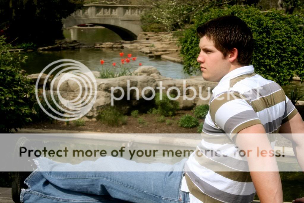
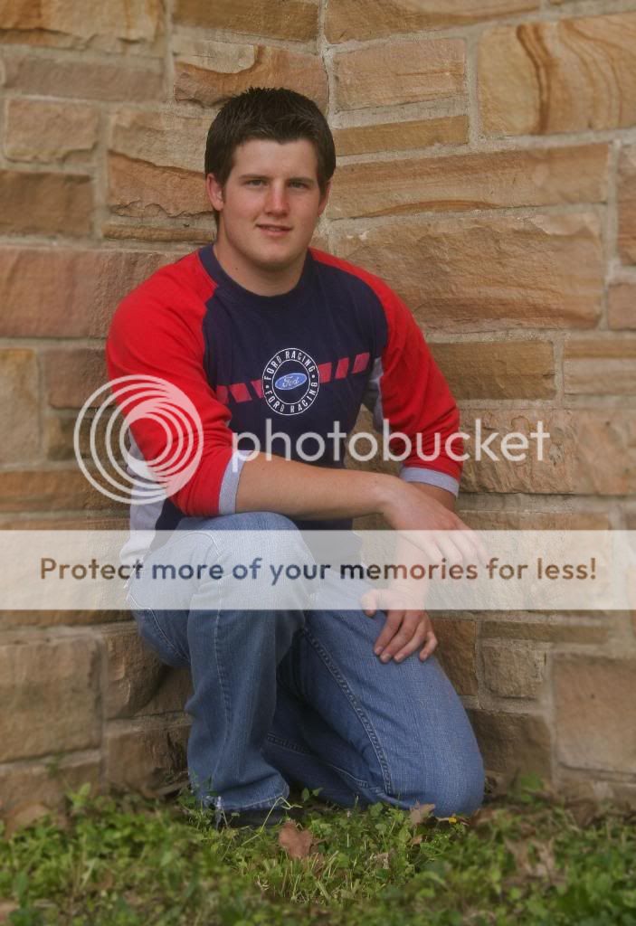
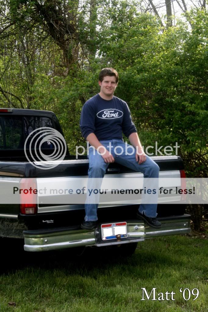
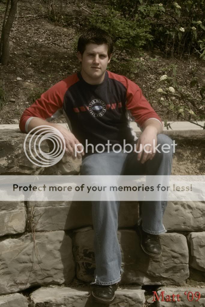
These are from a recent Senior session I did and I was just looking for some insight as to some areas that I can improve. I shot them with my Reble xti and kit lens, outdoors with the natural light as my only source of light. I was just going for unique senior shots. In my opinion the whole shoot turned out blah. I'm not sure if anyone has ever had this before, but like no creativity as to how to pose the subject, well that was the case this certain session. Here are a few that I think turned out real well. Please tell me exactly what you think.
IMG 1
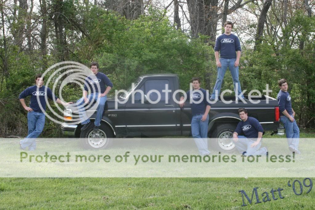
I.jpg
now I realize this one didn't turn out real well if you zoom in on it. I had a tripod set up to get the various shots, on gravel....not the best thing....
IMG 2
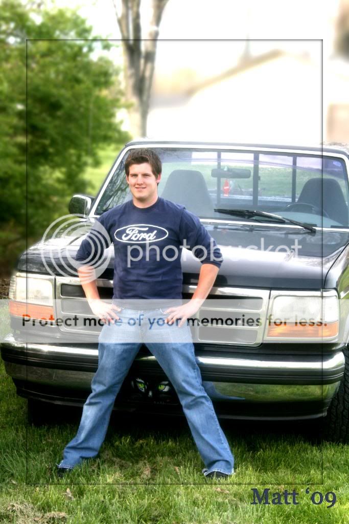
BB.jpg

IMG 3
CC.jpg

IMG 4
EE.jpg

IMG 5
X-1.jpg

IMG 6
J.jpg
 
Last edited:
Look good, i dont know if thats your marking in the middle of some of the photos, or what but some of them are blurry in the center, others a bit blurry on the edges, 1, 3, 4, and 5 seem a little to hazzy, kind of hurts my eyes.
 
IMO

#1: This is great. He probably likes this one. He looks relaxed in most of the positions. Ok, this is coming from someone who knows NOTHING about post production, but it looks a little spotty. Is that a watermark in the middle? flare from the sun? Something is not right. I'm sure others will be able to pin point it better.

#2 is great, but I'm not so keen about his legs so far apart. I don't know the alternative, maybe a little closer together would have looked nicer. I'm not sure. And the sky is blown out (although, I am not always against it..I think it looks a little dreamy in some cases)

#3 the lighting looks nice, but he is squinting a bit and I don't like that the full hands aren't in the shot. Also, maybe not "masculine" enough of a pose?? He looks a little stiff with his arms back like that.

#4 I think this one is the best of the bunch. He looks relaxed and masculine. It just looks a little soft in the eyes. It looks like the focal point is on his knee.

#6 Looks like it needs some saturation. The colors look dull. And it looks like it is so soft around the edges. I think males look better in a sharper focus all around. The soft edges seem too feminine for my liking. Maybe it's my eyes though or monitor.

Ok, I hope that doesn't sound too harsh. Overall, the pictures are nice and your subject looks really cute in these and I bet he really likes them. You have done a great job capturing his love of his truck and his kind nature (or so it appears).

Please take my words with a grain of salt. I am NOT a professional by any stretch of the imagination!
 
Kardon: I noticed that eek!! He didn't...thank goodness!! I see what you mean on 1,3,4 and 5...thanks

linpelk: thanks SO much I appreciate your critical input...that's what I was looking for...#1 I noticed that after I had finished editing and was looking at the CD on another computer...scarry that mine didn't show that!! #2 thank you...I had not noticed the sky and I totally see what you mean...I was just trying to get the building out...it was a restroom lol....deffinately remember that for future reference!! #3...I wasn't sure about that either....it was his own pose...so I put it on here actually wondering if that was something photographers do these days... #4 thank you...will work on that #6 interestingly enough, has been 3 or 4 peoples favorite...thanks again for your detailed comment....I REALLLYYY appreciate it!! You gave me a lot of things to remember in the future!! Thanks!!
 
Only Thinhave to say is the pose in #2 seems unnatural.

The rest, other than little things I like them, Gave me some ideas for when I do my brothers portraits :D
 
Don't know if maybe you would want to blur the liscense plate on a public forum. I know that there is no last name but... just a side note
 
The first one looks like you shot it through the window from the house. The rest look like Senior Portraits. The color of the Earth is a bit dull, but PS can fix that.
 
#4 and #6 have some serious contrast issues, which makes the image come out very flat, and listless. The shots with the Ford Truck have a sort of "smudge" to them, as if the center of the shot was obscured by an opaque surface. Not in all of them, but the first one and a few of the others.
 

Most reactions

New Topics

Back
Top