Senior Portrait Session - Critique Welcome

ThunderAndRain

TPF Noob!
Joined
Sep 5, 2017
Messages
3
Reaction score
0
Location
Maine
Can others edit my Photos
Photos OK to edit
Hello All,

I'm pretty new to this forum, but it seems like an excellent place to share ideas and get another pair of eyes on our images.

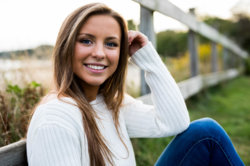
I had a senior portrait shoot last night that I feel went very well.

Please let me know any thoughts you have.

Thanks!

IMG_5399.jpg IMG_5434.jpg IMG_5447.jpg IMG_5451.jpg IMG_5461.jpg IMG_5479.jpg IMG_5489.jpg IMG_5531.jpg IMG_5542.jpg
 

Attachments

  • IMG_5535.jpg
    IMG_5535.jpg
    246.4 KB · Views: 317
hard to mess up with a natural like that in front of the lens. #1 is a standout here.
 
A couple of thoughts: (1) Like so many other senior sessions this doesn't tell me anything about her, other than that she's an attractive young lady. What are her interests? Is she on any school teams or clubs? What does she do in her spare time? I think this could have been much stronger had you incorporated other aspects of her life.

(2) On the technical side, all of these desperately need fill light. The bright/blown backgrounds pull the eye away from the young lady; a couple of stops of fill would have dropped the backgrounds down, brightened her face and put a nice catchlight into her eyes. That said, while rather too thin for my taste, you've maintained good control on your focus and DoF.
 
I would agree with both of the above. What I would add to that is be careful of cutting off body parts. Examples: the "ghost fingers" in #2 and the chopped off fingers in #4.

I really like #4 the best followed by #1, #7 and #9.
 
A couple of thoughts: (1) Like so many other senior sessions this doesn't tell me anything about her, other than that she's an attractive young lady. What are her interests? Is she on any school teams or clubs? What does she do in her spare time? I think this could have been much stronger had you incorporated other aspects of her life.

(2) On the technical side, all of these desperately need fill light. The bright/blown backgrounds pull the eye away from the young lady; a couple of stops of fill would have dropped the backgrounds down, brightened her face and put a nice catchlight into her eyes. That said, while rather too thin for my taste, you've maintained good control on your focus and DoF.

Thanks! This is great advice. I did take a few of her and her boyfriend together, but incorporating her athletics and other hobbies would have made the set stronger overall.

I'm considering purchasing a flash/strobe for fill light. Do you have any recommendations? I'm shooting on the 5D MkIV
 
For this sort of work, you want something with an integral battery and HSS capability, and ideally of at least 400 w/s. Used in conjunction with a medium size brolly-box (~48"), this will REALLY step up the quality of your images. You can spend anywhere from $2000 for the Elinchrom version down <~$500 for the Flashpoint/equivalent version.
 
Please let me know any thoughts you have.
Hello! Welcome!

Except for #1 & #4 they need fill light. (mentioned above)

Facial contortions in #1 and #9 (see why we want them numbered?) are "scrunch-face", and should be binned.

I'm not a fan of #4 due to foreshortening. It makes her head look unnaturally large in comparison with her body.

I'm also not a fan of #3 due to the distracting element (water) behind your subject. (Pose is nice, though.)

#5 &#6 are the best of the bunch, followed by #7 & #8 (which, except for her hand/arm placement, could have been as good as 5 & 6.)

And when you get your light(s) and modifiers, you should study up on where and how to place them for good effect. If you get just one good light and modifier, remember that a large white reflector can be used on the off side.
 
here's a good example of what some were saying about fill.

I took both these shots at the same setting exposing primarily for the BG. I was facing the sun, so naturally the subject(s) and we were under full shade. I simply held a 24x24" softbox up and bounced some light back into her face. look how much better it looks: she's much better lit and her eyes glow and have a great catch light. it's simply much more flattering and better overall.

yeah the photos themselves are crummy...I was just fooling around teaching her to use a reflector, but i thought I'd share here as well as I remember this came up in your thread.

DSC_0793.jpg


DSC_0794.jpg
 
Now see I kind of like #9 because it made me smile the way she's laughing, it's just such a fun picture of her that makes you want to laugh with her. But, I do think the white sweater blends in somewhat with the water.

I'd suggest thinking about some slight adjustments to the angle and perspective; not much, just a step or so can do it. Like the one with the puddle (or whatever it is, not exactly a puddle) - it might have been better if it wasn't directly behind her. Or the one of her in the purple, seated, that might be better with just a little less of the gray stones to her right in the frame and in the composition.

Overall it's a nice set, she probably would be pleased with these. And I know the prop thing has been popular and can be fun but I don't know that it's necessary. I suppose it depends if the person wants to include something about their school and activities etc. These show me her personality which I think works.
 
I like shots 1,6,and 9 the most. I do not agree that the so-called facial contortions would cause 1 and 9 to need to be binned...far from it! I reallllllly think that on-site reflector fill, not flash fill, could have made these simply outstanding. Flash fill "works", yes, but I really prefer the look from reflected light that is on-site, especially when that fill light comes from a fairly large reflector panel. She's pretty, but some eye-sparkle would have made these even more pleasing shots. Still...they do have a certain appeal to them in the way there were lighted and shot.
 

Most reactions

New Topics

Back
Top