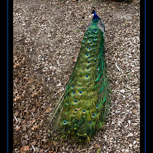
Shape of Despair

I am glad that someone has open mind :) Thanks, Bossy.

You seem defensive towards negative feedback... If everything wrong with the image was deliberate and you only praise the positive C&C, why not just show it to family and friends so they can stroke your ego?
Don't preach to me. Preach to your impudence.
 
I like it. I especially like how the silhouetted subject is so well defined by the light area of the final half-archway in the background. The lightest area draws my eye right to the subject, as it should.

The darkness, tight areas causing just a bit of claustrophobia, rough textures, induced perspective tunnel vision, and shape of the hand to the head of the subject all support the idea of despair well, IMHO.

The CC's around here are a mixed bag of opinions that range from very well informed to ridiculously nit-picky drivel written by noobs pretending to know something, the latter mostly by folks who don't really know squat other than to pick at what they think are "flaws" based on things they've seen other people say at some point. It appears that they think being deeply opinionated mixed with a bit of rude makes them tres cool photographic arteests, then they hide behind the "if you can't take critique, don't ask for it" copout when corrected. Just thank them for their time and move on, whether you find what they have to say valuable or not. It's easier that way.
 
Thank you very much on your kind words and support, I appreciate it. You got a beer :)

I like this very much, especially use of the word claustrophobia.
The darkness, tight areas causing just a bit of claustrophobia, rough textures, induced perspective tunnel vision, and shape of the hand to the head of the subject all support the idea of despair well, IMHO.
.
 
I am glad that someone has open mind :) Thanks, Bossy.

Don't preach to me. Preach to your impudence.

Ironic that you speak to others about impudence.

I am not preaching, just informing you that it will go much more smoothly if you don't pretend your mistakes were on purpose or get defensive when people give you honest feedback.
 
Informing, preaching... All the same. I see no point of your words.
I see no mistakes here and I do not pretend at all. I have right to defense my work and to disagree. I dont' really care how you take my words.
 
Frame within frame within frame........ and the main object somewhere in between....that is a good idea....
Choosing Monochrome...that is a good idea...
What she is doing... i think there is a glass in her palm and it is as if she drinks water from it... one cannot drink that way from a glass.... an excuse is that while drinking from a half filled glass initially we bend towards it and then only we raise it along with head...if it is that way, this was the wrong time to click...the thirst and despair will be hilighted only when she lifts her head to take even the last drop......
If she does not have a glass in her hand, her posing is highly artificial and anti climax to the concept
PS: Why so much of harshness and acridity in our discussions and disputes i don't know..... We are all here to be happy and sharing... Out in the world, there is enough space to fight ;)

Typo in spelling is human, typo in attitudes is really painful :grumpy:
 
You are absolutely right. Thanks a lot.
An interesting point of view. I am glad there is different perspectives at the photo. Everybody experiences it on its own way.
 
This is possibly an example of an image that doesn't need a title. Nearly everyone, including myself has judged the image right off, based on he title.

I don't see despair either. I related her "pose" or gesture to a moment of zen, or yoga.

I think it is a well done image, in my opinion.
This can be an interesting discussion...when images require a title to lead the viewer in the right direction because the image doesn't tell the story well enough on its own, or when the title is in conflict with what the viewer sees, does it hurt the impact for the viewer?

Which is better?
Personally, I'd prefer to leave the interpretation to the viewer, and leave it open. Otherwise I risk losing the audience if they dont "get" it.
I would feel like I failed in conveying my intent.
 
The title doesn't at all match the image. IMO, you're better off without a title at all. Let the viewer experience it freely and openly...

Nice shot though. It could have been a lot stronger with a shallower DOF, but your take on the shot was nice as well.
 
I also dont't see despair either. But I like the image very much. Especially the framing and sillehuete. When I see the position of the subjects hand I don't feel despair. I believe with a different hand position despair may have been achieved. If this is street photography then I can't say anything negative on that because you exposed a interesting, thought provoking image, the hand position is negligible. But I don't "feel" despair.

If this were a set up shoot then maybe a slightly lower head position and maybe even two hands on the head or even with the head to knees while sitting might have helped foe the feeling of despair.

I really do like the framing. I am enjoying the tones and where you placed them. You have the brightest part of the image as as the background but with the front part of the image still brighter than the middle it brings the eyes to the sillehuete. It also creates a double framing effect. The subject is framed by the archway and by the toning.
 
Last edited:

Most reactions

New Topics

Back
Top