W.Y.Photo
No longer a newbie, moving up!
- Joined
- Aug 10, 2014
- Messages
- 874
- Reaction score
- 203
- Location
- Harlem, NY
- Can others edit my Photos
- Photos NOT OK to edit
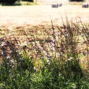
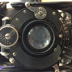
I was going to say, that's a sharp Sharpie! But it seems just a tad soft to me. Of course, I could be mistaken. Anyone else?
Could use some more DoF..
I think its focused on the name not the edges.