She... Updated version included

I LOVE your lighting here! Care to share what you used here?
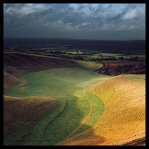
nothing... well.. the camera and lens... :)

Everything I shoot I shoot with available light
 
Last edited:
I love the trees. A version without het in it would be wonderful also.
yeah... probably... because it is a really nice place... those colors are close to the real colors there... lots of autumn leaves in that piece of wood
 
Excellent.

Don't crop it (much ;))! The vertical motive in the trees works really well against the diagonal motive in the subject's gaze, arms and the slope of the ground. There's a real tension here that's more than the sum of it's parts. :)

I'm curious though about why you've not used the full range of tones and the slight warm colour balance. Not using the full range of brightness tends to make images more dependant on the background against which they're viewed, perception of contrast and colour can change slightly. The slight warmth in the image I think seems to affect the perception of the colour of the jacket. I would go with a slightly cooler balance on the subject in relation to the background, but not so much as to separate her from it.

Also the bokeh of the lens is a little choppy, which will probably be exaggerated on the resize, so I'd be tempted to add a little gaussian blur to the background in the original just to smooth it a little.

I would also be tempted to crop a smidgen from the left and top just for a more neutral balance.

Offered as different only, not correct, open in separate tabs and flick between them:

mod-1.jpg
 
interesting, I think I would also crop it but the trees do add to the pic
 
Lovely lighting. To me the skin has an oddly cold look to it with a bit of an unhealthy looking yellow mixed in. As far as the crop goes, I understand what you're doing. I like a lot of room above a subject like this in some photos as well. I do think perhaps you could shave a little bit off the top though; there is so much space above her in comparison to how little of her that we see, that I think the empty space above her really fights for my attention, and makes her seem small and unimportant when I look at the shot.
 
I think it looks great!!

I think her chin might be tucked in a little too tight, and showing a little more of her body would be perfect. I think the vertical crop is intriguing :)
 
Excellent.

Don't crop it (much ;))! The vertical motive in the trees works really well against the diagonal motive in the subject's gaze, arms and the slope of the ground. There's a real tension here that's more than the sum of it's parts. :)

I'm curious though about why you've not used the full range of tones and the slight warm colour balance. Not using the full range of brightness tends to make images more dependant on the background against which they're viewed, perception of contrast and colour can change slightly. The slight warmth in the image I think seems to affect the perception of the colour of the jacket. I would go with a slightly cooler balance on the subject in relation to the background, but not so much as to separate her from it.:
.....Offered as different only, not correct, open in separate tabs and flick between them

I wanted her to blend with the background nicely, that's why I didn't "cool" her much. In your version her skin looks odd (as in mine first version but I wasn't aware of it until I read all the comments, must admit)

Also the bokeh of the lens is a little choppy, which will probably be exaggerated on the resize, so I'd be tempted to add a little gaussian blur to the background in the original just to smooth it a little.
Totally agree but Gaussian blur didn't come to my mind at all, ty

I would also be tempted to crop a smidgen from the left and top just for a more neutral balance.
yeah... I cropped it a bit


Thank you for your suggestions, they helped :)
 
interesting, I think I would also crop it but the trees do add to the pic

I cropped it a bit in the updated version
I think it looks great!!

I think her chin might be tucked in a little too tight, and showing a little more of her body would be perfect. I think the vertical crop is intriguing :)
:)
thank you
I plan to do similar shot so I'll do some things a bit differently
 
Lovely lighting.
... and the simplest/most beautiful also... natural

To me the skin has an oddly cold look to it with a bit of an unhealthy looking yellow mixed in.
I didn't noticed that at all. I kept looking and trying to figure it out but I couldn't, then I tried to warm her face with the brush in overlay mode and then I saw/understand what were you saying. Look at the updated version.. Better?

I really need to pay more attention to retouching. I think that's one of my biggest problems. I spend too little time on it.

As far as the crop goes, I understand what you're doing. I like a lot of room above a subject like this in some photos as well. I do think perhaps you could shave a little bit off the top though; there is so much space above her in comparison to how little of her that we see, that I think the empty space above her really fights for my attention, and makes her seem small and unimportant when I look at the shot.
I cropped a bit.

Next time I'll do some stuff a bit differently.

ty
 
Last edited:
Very nice mmaria, that is one awesome background and I do like the pose and the lighting on your model too.
glad you like it Pete, ty :)
 

Most reactions

New Topics

Back
Top