TheNevadanStig
No longer a newbie, moving up!
- Joined
- Feb 18, 2014
- Messages
- 693
- Reaction score
- 597
- Location
- Reno, NV
- Can others edit my Photos
- Photos OK to edit
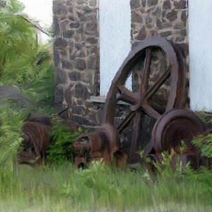
Rare non-wildlife shot from me. But it was out by the wetlands. There was something about all the spray used to cover up graffiti, the rust, the age. It caught my eye, I thought it just gave it an interesting texture so of thing.
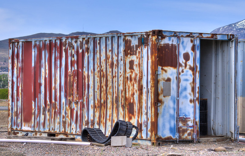 container by TheNevadanStig, on Flickr
container by TheNevadanStig, on Flickr


![[No title]](/data/xfmg/thumbnail/37/37631-1af996afcca522b3c5490538125d9599.jpg?1619738155)
![[No title]](/data/xfmg/thumbnail/31/31085-9786bf0c16c072633ecdfad477c23095.jpg?1619734600)