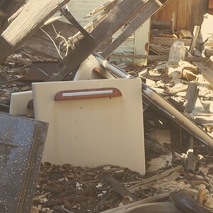
that's correct... it's supposed to be a shot of the whole scene, without a particular object in focus. As for cluttered, I can kind of see that... maybe a bit. Thanks
that's correct... it's supposed to be a shot of the whole scene, without a particular object in focus. As for cluttered, I can kind of see that... maybe a bit. Thanks
When there is not a main object of focus it is difficult for the viewer to navigate the photos. Certainly there are many compositional styles, but the viewer should easily navigate the photo, be drawn in if you will. I think that is what Bike Mike was getting at.
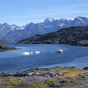
I think this would be a stronger image with some exposure adjustment. On two different monitors this looks underexposed. Perhaps just having the three ships that are closest and not the other ones on the water would help remove some of the areas that are not as important to the photo.
The pier in the foreground is useless in this photo I think. I would rather see the bottom of the photo start at the boats, or maybe a bit of the pier there, but not all of it. Also the contrast is kind of flat. I too would like to see the tops of the masts. I feel like I'm missing something.
You could have just raised your lens a bit so that wasn't showing. How wide your lens was shouldn't have affected that. The wider it was, the more would be showing. If anything a longer lens would have shown less of the pier.
"You could have just raised your lens a bit so that wasn't showing"
I tried that at the time of course, but it cut too much out of the scene. I wanted to capture as much of the ships as possible. I'll try and cut it out using software and see if that helps, thanks
That doesn't make sense. If you raised the lense to "crop" out the pier, you'd be showing more of the boats. You'd have included all ore more of their masts. All you would have done was eliminate the pier and put that percentage of the photo on top.

![[No title]](/data/xfmg/thumbnail/32/32709-80f0f0432fd5ec548a3efdb60ef77d46.jpg?1619735613)
![[No title]](/data/xfmg/thumbnail/32/32706-50b778fbc110c8ea4472547d54c6a923.jpg?1619735610)
![[No title]](/data/xfmg/thumbnail/32/32707-3c49d54a87afb53e65c60391858400be.jpg?1619735611)
![[No title]](/data/xfmg/thumbnail/41/41765-153b10bab62ae8adbcc4d984fd08ed74.jpg?1619739885)