" SHOOTING THE HARBOR BLDG. "

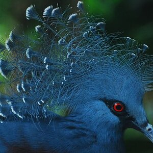
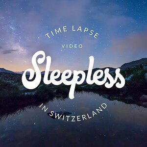
If I were working on a high res original, I would select the offending blues only and would work on them, rather than losing the clarity of the original.
 
Moe... Thanks for comments... about your question, you lost me ?? not sure what you mean?

just joey.... Thanks for commenting... I agree , the white s are somewhat blown..

Traveler... Think I got it toned down some, this work better for ya ?
 
Purely from a composition standpoint, I like #2. #1 is a beautiful shot, but the foreground bushes are distracting. I really like #2 because if this is a harbor bldg, one would expect to see boats around it just like you have shown in the shot. Both shots are beautiful. I really like your work!
 
i also think there's too much water, mayeb make it sort of a panoramic type shot by croping out sum of that water?
 
Traveler.... yeah, I thought that after making quick redo...lol

teachflute... I appreciate it!

just x joey.... hmmm pano could work... consider that... Thanks again..
 
I don't have a problem with either image. They are two distinct shots. If I were to change anything at all I might cut out an L shape of the right side vertical and bottom horizontal to remove a tad of the water and to eliminate the rightmost mast just to the side of the yellow slicker. I have not tried it so I do not know how much it might change.

Rusty Tripod
 

Most reactions

New Topics

Back
Top