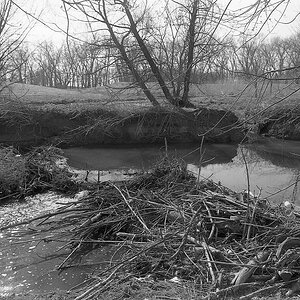
I'm working on processing B&W images and think I might be making progress. It seems to be a rather steep learning curve. I'm especially trying to get images with high contrast and know enough now to look for high contrast scenes, so at least that's a start. Comments welcome. Thanks.
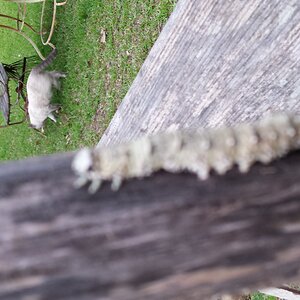
Well done, and good progress. Fun stuff. Not sure of your workflow but I might be tempted to convert film to a digital file (is via Epson scanner) and bump the contrast in PS, etc. Otherwise, if memory serves, there are more/less contrasty film developers, and times of development, and of course the Ansel approach of under expose and over develop, etc etc in his iconic books on Film and Print. (He was way ahead of PS.) Maybe not what you were looking for here, but you might have kindled an old interest in this old brain cell. Then there's always shooting in digital, and editing for BW? Your shot of Fox may have that muddy feel but also could be over-baked polarizer or red filter. So maybe reduce either in the edit?
To help “see in B&W” remember that tones representing “colors” do not have the same visual contrast as the original colors; that’s where all the (old) “color filters for B&W” help.
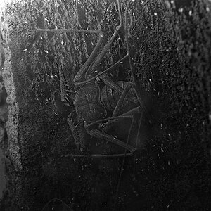
• If you are shooting B&W Film, you probably have some of those “Wratten”filters already: various red–orange–yellow (#25/A, #15/G, #8/K2) to darken skies & other blue subject areas or lighten warm-colored subject areas (*like Bricks in the Wall of your Photo-3*), and various green (#11/X1) to lighten foliage, etc.
• If you are shooting Color Digital and “converting” to B&W Digital, you have the same options—with digital instant adjustment feedback—for avoiding having Different-Color Tones becoming essentially Same-Gray Tones.
Well done, and good progress. Fun stuff. Not sure of your workflow but I might be tempted to convert film to a digital file (is via Epson scanner) and bump the contrast in PS, etc. Otherwise, if memory serves, there are more/less contrasty film developers, and times of development, and of course the Ansel approach of under expose and over develop, etc etc in his iconic books on Film and Print. (He was way ahead of PS.) Maybe not what you were looking for here, but you might have kindled an old interest in this old brain cell. Then there's always shooting in digital, and editing for BW? Your shot of Fox may have that muddy feel but also could be over-baked polarizer or red filter. So maybe reduce either in the edit?
Thanks for your input. I do shoot digital exclusively; although, I have thought about film now that I’m doing more B&W. It brings back memories of the old Olympus 0M-2 and the darkroom in the closet. I did go back and make some changes to the original posts after receiving advice. Definite improvements.
I would recommend you to work on every single color separately until you're happy with your results. Meaning: with the Hue/Saturation tool you also increase or decrease each color's Lightness.
Once done with your image you can use the Curves tool to adjust for the right contrast - and again you can do this for the entire image as for RGB individual. Hope this helps