Third one is the winner for me. I like the delicate shades in the first two, but...dunno, it needs something. The first one is a bit too flat somehow. The second gets better because the cloud over the sun gives some depth and texture. And then the third has not only great vibrant color but a great sense of depth and expanse. And I really like the rock in the line of the sun, breaking up that expanse a little and giving it some scale and more texture.
Silly o'clock Using the 24-hour clock, it's also called oh-dark-thirty

 Using the 24-hour clock, it's also called oh-dark-thirty
 ")
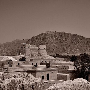
![[No title]](/data/xfmg/thumbnail/33/33339-c5b461af62b32f6b6529f1b334d818ba.jpg?1619735909)

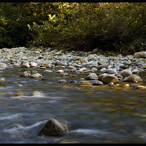

![[No title]](/data/xfmg/thumbnail/36/36600-689bc868e20f53581a083c9054ee0e47.jpg?1619737641)
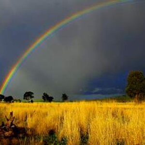


![[No title]](/data/xfmg/thumbnail/33/33337-23549254ce2ac92ac5cb86ac0366633f.jpg?1619735908)