Snowstorm and others

ksmattfish

Now 100% DC - not as cool as I once was, but still
Joined
Aug 25, 2003
Messages
7,019
Reaction score
36
Location
Lawrence, KS
Website
www.henrypeach.com
Can others edit my Photos
Photos NOT OK to edit
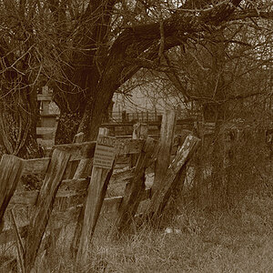
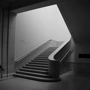
Some shots from the snowstorm...

339%3C652723232%7Ffp54%3Dot%3E232%3B%3D6%3A4%3D%3A83%3DXROQDF%3E23234%3B7833443ot1lsi


339%3C652723232%7Ffp58%3Dot%3E232%3B%3D6%3A4%3D%3A83%3DXROQDF%3E23234%3B7833444ot1lsi


339%3C652723232%7Ffp58%3Dot%3E232%3B%3D6%3A4%3D%3A83%3DXROQDF%3E23234%3B7833446ot1lsi


Tmax 100
Pentax 67II w/90mm

Scanned from 8x10 Arista glossy FB
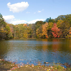
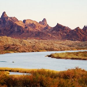
 
A few other landscapes...


Prairie Rocks
339%3C652723232%7Ffp54%3Dot%3E232%3B%3D6%3A4%3D%3A83%3DXROQDF%3E23234%3B782%3C454ot1lsi


Arista 125 4x5
Anniversary Speed Graphic w/Schneider Symmar 150mm


Clinton Lake fog, before sunrise
339%3C652723232%7Ffp58%3Dot%3E232%3B%3D6%3A4%3D%3A83%3DXROQDF%3E23234%3B782%3C455ot1lsi


Tmax 100 120
Rollei 3.5E w/ 75mm Planar


Wetlands fog
339%3C652723232%7Ffp54%3Dot%3E232%3B%3D6%3A4%3D%3A83%3DXROQDF%3E23234%3B782%3C458ot1lsi


Arista 125 4x5
Anniversary Speed Graphic....
 
Awww, everyone's gotta love the second snow storm photo!
Well, I do, at least.

I'm too much of an amateur to give you any serious critique, all I can ever express over photos or pictures are my own feelings and emotions. And with your second snow storm photo I thought "Yessss!"

And since I'm a huge fan of wetlands of any kind, your wetland photos speak to me DIRECTLY because of their motif. So, yesss!, I like those, too. Reflections are something special, over and again. Almost like sunsets ;)... Not in the "kitschig"-way. No! It's just that I am a fan of wetlands. I wish I could force myself one day to get up early enough for some fog-before-sunrise photos in my favourite moor.
 
Hi Matt, good see you finally get some of your snowshots here.

Number 2 caught my eyes immediately here. When i look at it I see very very very faint lighting patterns/shadows on it, I guess i would like to see that emphasized more, thats just my personal preference.

Number 3 looks really cool, but I had to take a long hard look to see the dark roots, i don't know if the info got lost in the scan. It looks like shelter from the snow, but with an ominous opening. But I am struggling to see the roots here - would like to see them stand out more.

I can't believe I am actually saying this about one of your photos, but I am just not getting number 1. :scratch: I see continuity in the vertical stems, with the warped tree sort of serving as a counter balance. But its not doing anything beyond that. Maybe I should ask you what you had in mind when you took this shot?

edit: you uploaded some new stuff, whilst i was critiquing!

love the prairy rocks pic, its a very primeval feel to it, can't say that i would change anything at all about that and the 2nd wetlands photo.
 
vonnagy said:
Number 3 looks really cool, but I had to take a long hard look to see the dark roots, i don't know if the info got lost in the scan. It looks like shelter from the snow, but with an ominous opening. But I am struggling to see the roots here - would like to see them stand out more.

The subtle tonal differences in the shadows of the print didn't scan very well. I'll probably have to scan from a different print.

It's always a long process for me to work out snowy prints. This is from the first batch. I'll have to do it again and again...

#1 is my favorite of the snow storm pics. This is a composition that I like to use when photographing trees. A lot of my tree pics are set up like this. I think it comes from watching movies. I have no idea why I like to use it with trees. It's not real exciting, but then again, the actual scene was about as serene as it gets.
 
Some very cool shots. Great composition. I especially like the second set you put up. The snow shots are very nice, too. About the only critique I could offer is that snow is a royal PITA to shoot, and these might benefit from a slight increase in brightness (the snow in a couple of them looks greyish). Still awesome stuff though. :D
 
Shark said:
About the only critique I could offer is that snow is a royal PITA to shoot, and these might benefit from a slight increase in brightness (the snow in a couple of them looks greyish). Still awesome stuff though. :D

I agree. That's part of my problem. These were taken during the snow storm, so actually contrast is way down, and the snow would accurately be represented as light gray (zone 7 or 8), but I to tend to want to print it white. I'm still working on the secrets to printing snow. Maybe I should overdevelop the negs when I'm shooting snow to up the contrast?

Recently I've also been having problems scanning from FB paper (at least I haven't been all that happy with my results). It's so stiff around the edges that sometimes I get weird scanner flare (and I even put a weight on my scanner lid). I don't know, maybe I'm asking too much to get the quality and detail from MF and LF out of a cheap scanner and a 72 dpi file?
 
I like the second ones of each set the best. #2 of the first set has a great graphical nature to it. I'd love to see it bigger so that any fine tonal detail thats there can come out.
#2 of the second has great lines and mood. I like the reflection of the trunk in the water. I think it would benefit from a black border rather than white, to seperate the sky from the "matte". Maybe one that has a soft edge to fit the mood.
 
I think the Clinton Lake Fog is the best of the bunch. The logs in the water lead your eyes into the rest of the picture towards the main vertical tree which is nicely positioned near it's "rule of thirds" spot. The reflections are sweet too.
 
markc said:
I think it would benefit from a black border rather than white, to seperate the sky from the "matte". Maybe one that has a soft edge to fit the mood.

My larger prints of this are printed full frame with a thin, neat (it's not perfect, but definately not "sloppy") black border with a DIY neg carrier, which is the only way I'm doing black borders right now. The print this was scanned from pretty much is full frame, but it was just a work print so I didn't fool with the border. Although I agree, I wish I had now. I really like 35mm and 6x6 printed full frame with the black border.
 
Don't have much time but... #2 WOW.. I love it... I also really like the fog. I have always loved the peaceful and almost spooky tone that the fog can give and you really caught the mood with this one.

I agree with the others on #1 thought... seams shallow. Very unlike you.
 
This is why critique is so interesting; my own feelings are almost the opposite. I consider Snowstorm #1 to be very ksmattfish (at least via the photographers that influence me), and it's my personal favorite. While Snowstorm #2 is probably my least favorite, and would be the one I would say is the most shallow (if I had to...). Anyway, as I've been moaning about, snow bedevils me. Try and try again.

In the second set #2 is my favorite, although I am fond of them all. I didn't like #3 right after I printed it, but it has grown on me. They all need more work. The texture in #1 on a big print is fantastic.
 
:scratch:

I can definately see how stuff gets lost in the scan... since you've mentioned 'serenity,' though I didn't see that at first glance.. i think it probably has come through in the original print.

Scanning is a really tough thing to do, i've tried to archive some of my early stuff on a good scanner, it seemed to soften the sharpness, tones - in short everything thing about the picture. I've seen a lot of posts here of scanned work that I know would look a lot better 'live'.

I am curious to see this pic on a larger scale though - any chance of posting an 800x600ish size jpg of #1 here?
 
man, i'm definitely diggin the last 2. others before that: of them, the exposed tree rootball is the most interesting. the others have pretty good lines, nice vertical natural movement in #1 but that's about it. again for #2, same comment but horizontal, though i do like the wavy nature of the movement in this one. for that reason i think it has merit as is.
the tree roots would look better if you could dodge them out a little, aweful tough to do in the traditional darkroom. in fact, given your method, every one of these represents quite alot of blood, sweat, and tears, doesn't it? for that reason alone they have value as is, i say.
edit- i went back and looked a fifth time, and something that had been tickling the back of my brain finally clicked: the second set is quite sharp, almost looks like these were shot with a digital. you did these in traditional darkroom? wow!
yup, the last two are outstanding. the second, with its diagonal line from lower left to center right is perfect, drawing the eye to the midground. perfectly balancing the overall photo in mid-ground is the tree and its reflection placed on 1st right verticle.
the horizon makes a nice reversal of motion, contrasting the movement in fore and midground. overall mood created here is intense- i love it.
job very well done, man!
 

Most reactions

Back
Top