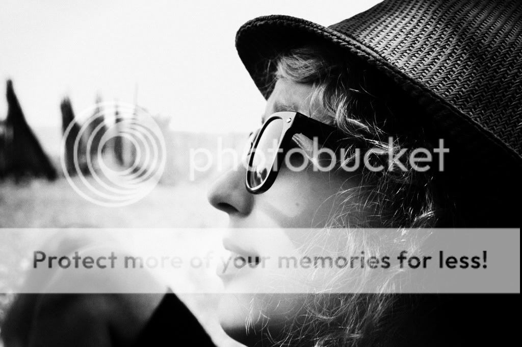
Number 1 would be my favorite for sure, however the knees by her head makes it look akward. If the knees weren't there it would be empty space but still better than the knees. Maybe get more of the other person in the background?
The first one is great, especially for just starting out. Good job. The last one needed a little more lighting and the middle one was unique with the texture
The one with the knees- it's kinda my bad, I know I should have paid more attention there, the knees should be gone from there...
The second one - I was aiming for texture
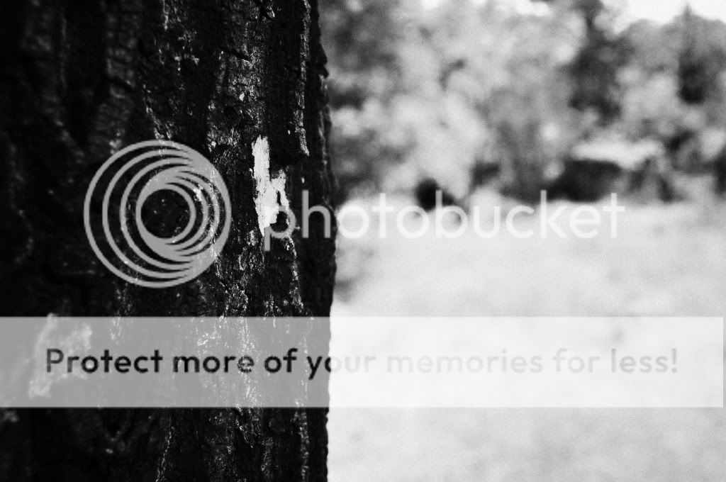
The last one - it is a tree, ok, but that white piece if you look more into it, looks like a heart, but that wasn't made by me, like carved into that wood


")

![[No title]](/data/xfmg/thumbnail/38/38736-5bc266b035e23faf5ad942bdd97466a8.jpg?1619738703)