Some B & W shots - c & c welcome

Lazy Photographer

TPF Noob!
Joined
Jul 4, 2009
Messages
648
Reaction score
5
Location
Toronto, Canada
Website
lazyphotographer.ca
Can others edit my Photos
Photos OK to edit
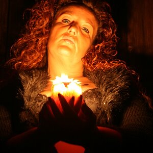
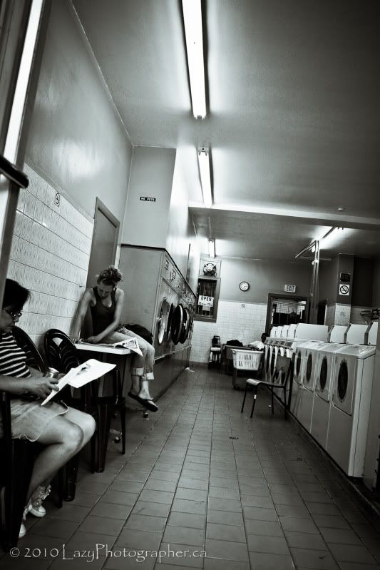
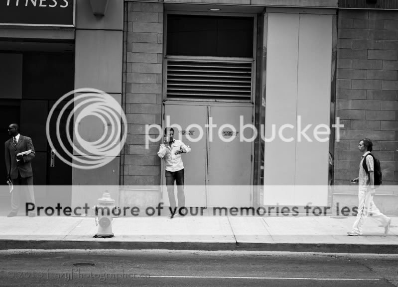
Well, two aren't actually b & w, but six out of eight ain't bad, right. ;)
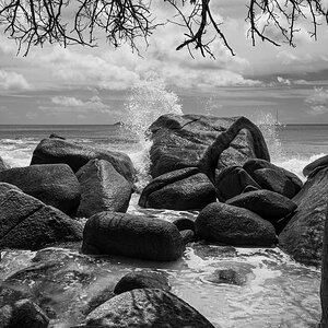
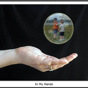
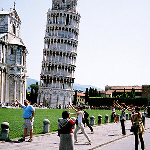
You'll notice I often use toning with my b & w shots, making them not entirely b & w. I had another photographer -- a buddy who shoots only b & w film -- tell me it was bad to use any toning and that I should remain committed to strictly black & white because the toning is a mark of a bad photo. But after looking around the internet I found that a lot of famous photographers will use some sort of toning in their shots. Any thoughts on this?
Also, I'd be interested in hear opinions on photo #5 in particular. Thanks.

1.
TOIsland-926-EDITED.jpg


2.
PortraitDay-0676-EDITED.jpg


3.
PortraitDay-0546-EDITED.jpg


4.
Caribana-510-EDITED.jpg


5.
Caribana-384-Edit-EDITED.jpg


6.
TOIsland-752-EDITED.jpg


7.
Caribana-081-EDITED.jpg


8.
TOIsland-925-EDITED.jpg
 
#5 is well done - you got these people at just the right moment (same for #1). It is a little tilted and possibly some perspective correction is needed as well. I hope there is a little more beyond what you are showing so you can actually tilt it without cutting off either of the people on the ends. I like the hydrant and the wall panels as additional vertical elements between the people.

#s 2, 4 and 8 don't really go anywhere for me. With #2, perhaps it is just that I don't like being reminded what it's like in laundromats!

I also like #3 a lot, but would crop on the left all the way to the back of the pickup truck. This would focus attention on the more interesting elements. Maybe a little off the top as well.

OK, my take on toning. If by toning, you mean just making a neutral bw a little warm or cool, I don't see how someone could object because darkroom photographic papers ran the gamut from very warm to neutral to cool with just the usual processing. Polycontrast papers even looked warm at low contrast and neutral at high contrast. This has always been part of bw photography. In fact, toning to get quite intense sepia or other tones was also practiced by many darkroom bw photographers. Some people haven't accepted that digital photography opens up additional possibilities and think anything that couldn't have been done in a darkroom is crap, but in the case of toning, quite a bit was done by darkroom photographers, so what's the basis for the objection? Most of what you've posted could have been done in the darkroom, except possibly #6 (like that one too, by the way), and that could have been accomplished by hand coloring. Were all photographers who did hand coloring hacks as well? I think not.
 
you need to tell your friend he is way off base.

serious black and white photographers tone their prints for several reasons. the most common being archival projection. selenium for one type and sepia for the other.

there are a wide variety of toners that aren't archival and some find them not atractive (does that some familar).

one had to print differently for different types of toners, as the toners change the silver content of the paper.

for some time now, many digital black and white photographers have been using various shades of duo or quad tones in ps as it is very difficult to get a netural black and white digital print from anything but high end commerical printers and/or with some using special rips and other aids;i.e. all grey inks which by the may be called black but aren't)

this is an area that is getting better, but until lower price printers are made that don't have a color cast to the black and white prints, folks will continue to "tone"

your friend needs to do a lot more research before talking out his hat.
 
1, 2, 4 and 6 dont do much for me.
3. Girl on the bike perfectly framed by the chairs, interesing shot.
5. Guy on the left is too close to the edge as with the guy on right, needs to be leveled I feel.
7. I like, nice comp, makes me curious regarding the couple.
8. I like this, but I think I would prefer it if there were no people I think.

Winner for me is a toss between 7 and 8 :)

I dont know much about B&W or toning, but I think toning has its place too warm or cool for sure, why limit your vision.
 
3 is superb.
 
Thanks everyone.
Unfortunately, I sort of blew it with #5. There's no room to straighten it without losing the guy on the left, I'm afraid. I really like the shot but wish my lens was wider. I was across the street and had no room to move further back. Oh well.
 
I think the tones are fine depending on the photo. #1 looks a tad overexposed. #7 looks a bit soft. I think #3 is my favorite of the bunch, I do wish however the chairs were not right out front.
 

Most reactions

New Topics

Back
Top