Oh, sorry about not putting numbers, it slipped my mind. And yes, you're very right about the last one; to tell you the truth, I really didn't feel that it had so much intensity being b&w. But, how are the other ones, anything I need to work on?
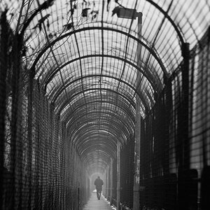
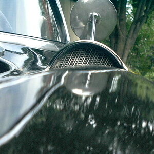
the 4th one has a nice mood, but I would experiment with different crops a bit. there is a lot of grey dull empty space in the top part.
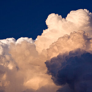
all except the first image could be bumped up in contrast a bit, but that is purely a question of taste, many people like high contrast iamges, others prefer subtlety though, which often gives more of the finer structures.
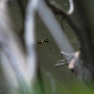
2nd and 3rd are a bit boring, with the 2nd having some charm in the road winding up in the image, but that back of the road sign is a bit useless.
#3 could benefit from more contrast in the sky, one could try that in postprocessing.
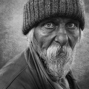
the first one is by far the best in my opinion. backlit leeaves are always nice, and the contrast here works well in b&w.
the 4th one has a nice mood, but I would experiment with different crops a bit. there is a lot of grey dull empty space in the top part.
all except the first image could be bumped up in contrast a bit, but that is purely a question of taste, many people like high contrast iamges, others prefer subtlety though, which often gives more of the finer structures.
2nd and 3rd are a bit boring, with the 2nd having some charm in the road winding up in the image, but that back of the road sign is a bit useless.
#3 could benefit from more contrast in the sky, one could try that in postprocessing.
the first one is by far the best in my opinion. backlit leeaves are always nice, and the contrast here works well in b&w.


")

![[No title]](/data/xfmg/thumbnail/34/34083-76406a409bc520ead3cc11af09ebd257.jpg?1619736269)
![[No title]](/data/xfmg/thumbnail/34/34082-cb4fe628070c391a1a71b4fdcc58f400.jpg?1619736268)
![[No title]](/data/xfmg/thumbnail/39/39290-dfb3e819bd94a7f30797638ae1ae27cf.jpg?1619738958)