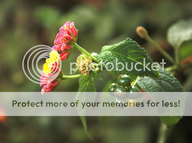
Noted about the cropping. I didn't want to have it too rectangular, you know?
About the background, I thought that's what made it interesting, but I had a feeling people wouldn't agree
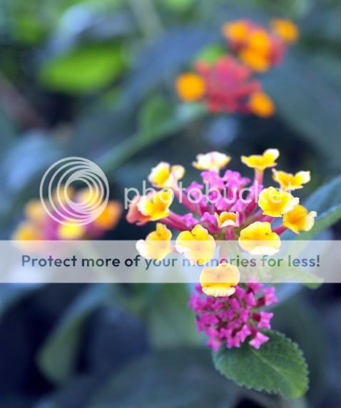
I like the color in the 3rd photo down, very vibrant. I would recommend cropping those images however, to keep the focus on the flowers and not the background.
I like the color in the 3rd photo down, very vibrant. I would recommend cropping those images however, to keep the focus on the flowers and not the background.
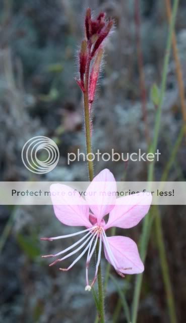
About 4, it's actually a very pale, almost white shade of pink. I was very surprised when it turned out pink in PP. But I see why it's not eye catching, it's rather flat.
I don't soot in RAW yet, but if I did, what would I do with this pic in RAW?
About 4, it's actually a very pale, almost white shade of pink. I was very surprised when it turned out pink in PP. But I see why it's not eye catching, it's rather flat.
I don't soot in RAW yet, but if I did, what would I do with this pic in RAW?

")

![[No title]](/data/xfmg/thumbnail/31/31751-fb2f68cca32f9eec468dbde7d649840f.jpg?1619734990)