eswarpr
TPF Noob!
- Joined
- Jul 11, 2011
- Messages
- 34
- Reaction score
- 4
- Location
- London, United Kingdom
- Website
- www.flickr.com
- Can others edit my Photos
- Photos OK to edit
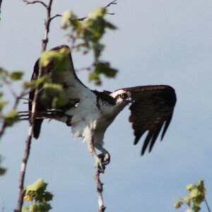
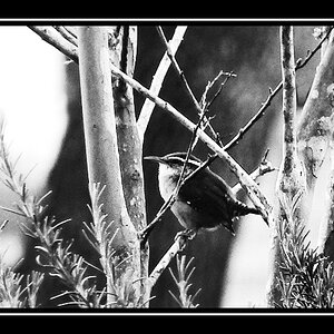
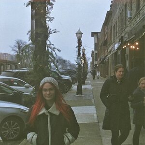
I have been absent from the forum, trying to learn more before posting. Here are a couple from my various experiments. Your thoughts, suggestions for improvements most welcome.

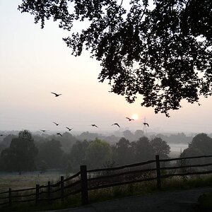
Inspiration by Eswar Prakash (eswarpr), on Flickr

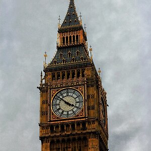
DSC_0500 by Eswar Prakash (eswarpr), on Flickr
Inspiration by Eswar Prakash (eswarpr), on Flickr
DSC_0500 by Eswar Prakash (eswarpr), on Flickr

")