Some photos for C&C

LouisRabin

TPF Noob!
Joined
Jan 10, 2012
Messages
6
Reaction score
0
Can others edit my Photos
Photos NOT OK to edit
I apologize for posting this wrong last time by using my Flickr account instead of a few pictures.

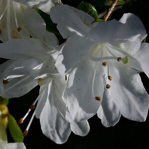
1.
6118510357_7364d84a88_b.jpg

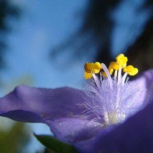
During hiking with a few friends i found this flower and the center of it amazed me

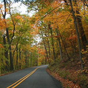
2.
6491051477_49c1832e4f_b.jpg

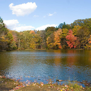
I go to school near Central Park and during the fall the trees are amazing. This is at "The Mall" near the boat house.

3.
6491063099_f4c26336da_b.jpg

Light breaking through the trees in central park on St. Pattys day

4.
6491073559_057db3c5d6_b.jpg

Tree near "The Dakota" in Manhattan

5.
6675730105_9de87899f1_b.jpg

A couple and what seems to be their grandchild in central park enjoying the nice fall day

6.
6235708721_4b71457018_b.jpg

A lone colorful leaf among grungy dirt and dead leaves

7.
6007773369_cb63d426a4_b.jpg

Duckling with her siblings that had hatched a few weeks before the picture was taken at a farm
 
Last edited:
I would try to limit the amount of photos you ask CC for. 7 is a bit much.

Many of the subjects in these photos are smack in the middle of the picture. Try reading up on the rule of thirds. They also look underexposed.
 
That's quite a few photos for detailed C&C so I'll be more brief than usual.

#1 I like that you centered the flower. It's such a strong symmetric flower that I think it works well right in the middle and the background is quite balanced in itself. I think I would have gotten a bit closer if your lens would accomodate it. I don't like the stems and leaves NE of the flower that are in focus. They throw off the image for me.

#2 The colors of the trees are certainly nice and you captured that aspect well. But the composition of the rest of the image, except for the level horizon, doesn't seem very organized to me. For example, you included the two pillars in the back but only the left one up front... why? And it's clipped off at the edge. Watch for these details. They can make or break a photograph.

#3 It's good that you are shooting the light as a subject, but this image falls short. You have a very dense foreground at the bottom of the image, which holds little detail and color. This demands attention for better or worse. Same with the bright sky above. The attention should be on the light hitting the leaves. Work on making them the brightest element in the image so they get the attention that you want them to have.

I think had you zoomed in and shot just the base and lower trunk of the tree and the lower tuft of yellow leaves, and moved to your left 10 or 20 feet to frame them against the darkest part of the background, you would have a more effective image.

#4 Interesting composition with the strong patterns at the bottom and the strong form of the tree moving upward. I'm not sure I understand the left/right alignment with the lines on the ground.... perhaps you could have made it more symmetric to match the rest of the image.

#5 Ehhhh, not working for me. I'm running out of time so I'll leave it at that.

#6 Again, out of time but what is the white object on the right and more importantly, why did you include it?
 
That flower is beautiful, the center is so different.
 
That's quite a few photos for detailed C&C so I'll be more brief than usual.

#1 I like that you centered the flower. It's such a strong symmetric flower that I think it works well right in the middle and the background is quite balanced in itself. I think I would have gotten a bit closer if your lens would accomodate it. I don't like the stems and leaves NE of the flower that are in focus. They throw off the image for me.

#2 The colors of the trees are certainly nice and you captured that aspect well. But the composition of the rest of the image, except for the level horizon, doesn't seem very organized to me. For example, you included the two pillars in the back but only the left one up front... why? And it's clipped off at the edge. Watch for these details. They can make or break a photograph.

#3 It's good that you are shooting the light as a subject, but this image falls short. You have a very dense foreground at the bottom of the image, which holds little detail and color. This demands attention for better or worse. Same with the bright sky above. The attention should be on the light hitting the leaves. Work on making them the brightest element in the image so they get the attention that you want them to have.

I think had you zoomed in and shot just the base and lower trunk of the tree and the lower tuft of yellow leaves, and moved to your left 10 or 20 feet to frame them against the darkest part of the background, you would have a more effective image.

#4 Interesting composition with the strong patterns at the bottom and the strong form of the tree moving upward. I'm not sure I understand the left/right alignment with the lines on the ground.... perhaps you could have made it more symmetric to match the rest of the image.

#5 Ehhhh, not working for me. I'm running out of time so I'll leave it at that.

#6 Again, out of time but what is the white object on the right and more importantly, why did you include it?

I appreciate the feed back, some things you said i wouldn't even have considered.

For #6 I believe it was a food container or something i dont really remember but my intentions were to get the duckling dead center and i couldn't work around getting that in frame but i love that picture even with the container.

What i got from this is I need to learn to analyze the surroundings more instead of only making sure i got the subject in frame
 
I would try to limit the amount of photos you ask CC for. 7 is a bit much.

Many of the subjects in these photos are smack in the middle of the picture. Try reading up on the rule of thirds. They also look underexposed.

Thank you for the suggestion, ill definitely look into it
 

Most reactions

Back
Top