
SeriouslyC
TPF Noob!
- Joined
- May 13, 2007
- Messages
- 34
- Reaction score
- 0
- Location
- Kent, England
- Website
- www.capturinglight.me.uk
- Can others edit my Photos
- Photos OK to edit
C&C would be appreciated, thanks.
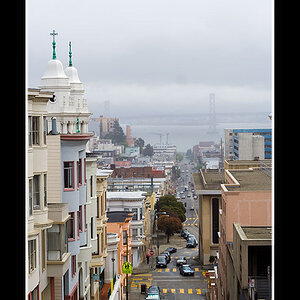
#1

#2

#3 - Big Daisy

#4

#1
#2
#3 - Big Daisy
#4


![[No title]](/data/xfmg/thumbnail/39/39500-340f9581ccea2902f4cca7c656232f9e.jpg?1619739057)


![[No title]](/data/xfmg/thumbnail/42/42060-f597479f8fd78d4bb4d17e7686fb0812.jpg?1619739996)
![[No title]](/data/xfmg/thumbnail/31/31042-2fcf80c8987688129be89876d12ba006.jpg?1619734584)
![[No title]](/data/xfmg/thumbnail/40/40308-f92e28f094216c151f3ad1fd7453c99b.jpg?1619739413)

![[No title]](/data/xfmg/thumbnail/42/42057-1509913128bb1db2bc11235c05832fd4.jpg?1619739993)